I recently painted a scene from the "Chicken Little" story for an upcoming conference. Here's my process for the illustration.
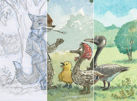 |
Above is a composite, showing the three main stages: sketch, color study,
and final painting. |
I start off by drawing the basic shapes with a blue pencil. I then go over the underdrawing with a soft lead pencil (see below). I can knock out the blue in Photoshop to clean up the drawing (cmd-U for Hue/Saturation, select Cyans and Blues, drag Lightness all the way over to the right). I print out my drawing at 100% final working size and use a light table to ink the drawing.
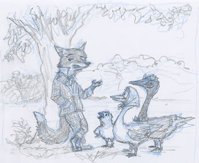 |
| Sketch. |
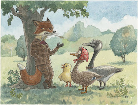
I find it helpful to do a color study. This one is about 9 by 7 inches (below).
 |
| Color study. Watercolor, ink, touches of pastel. |
Below is the raw scan without color correction. The painting is about 13 by 10 inches. I didn't like the way Chicken Little turned out, so I painted a few more versions. I know I can always repaint areas and use Photoshop to combine the patched section. And sometimes I'll just start over and call the abandoned painting another "study."
 |
| Raw scan. Watercolor, ink, with touches of pastel and colored pencil. |
Below are some alternate versions of Chicken Little. I find that I have more options in blending in the patched section if I paint in some background color. I don't want the patched section to look cut-out or have a white fringe around it.
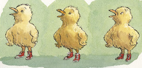 |
| I liked the middle one the best, so I dropped him into the final painting. |
This is what my Layer Panel (below) looks like for the final piece. You can see Chicken Little is on his own Layer (labeled "Chicken"). I used Layer Masking to blend him in, then I made a composite Layer (cmd-option-shift-E) and used the Clone Stamp to blend him in more. Sometimes I do my Cloning on a Layer above the patched section. For more on how I adjust scan colors, please see
this blog post, "Optimizing a Color Scan." The short version is that I select each color field (e.g. all the green grass), and then use a Color Balance Layer Adjustment. I do this for each major color while comparing it to the original painting.
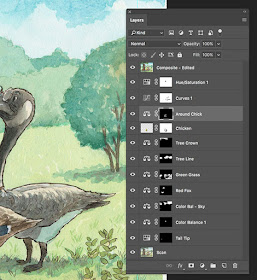 |
| Layer Panel. |
And here's the final, optimized illustration with the new version of Chicken Little blended into the scene. I also use a Curves Adjustment Layer to increase the contrast (and better match the original painting).
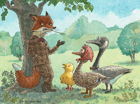 |
| The final, optimized illustration (with the replacement Chicken Little). |


