I recently read "All the Birds in the World" to some folks at the Acton Memorial Library. I also talked about my inspiration for writing the book, did a drawing of Kiwi, and raffled off a book and a jigsaw puzzle. Here are a few pictures.


David Opie Illustration
I recently read "All the Birds in the World" to some folks at the Acton Memorial Library. I also talked about my inspiration for writing the book, did a drawing of Kiwi, and raffled off a book and a jigsaw puzzle. Here are a few pictures.
 |
| Here I am, answering questions and bending my arm. |
 |
| A raffle winner taking home a "Gator" coloring book. |
 |
| More raffle winners. |
 |
| Signing books (and drawing a picture inside). |
 |
| Here's the raffle winner for the large drawing I did. She was planning to frame the drawing and give it as a baby shower gift. |
 |
| The final illustration. |
 |
| It all starts with a pencil drawing. I add tone in Photoshop to create a value study. |
 |
| Here's the ink drawing on Arches cold-press watercolor paper. I use a light table to trace my drawing. I mostly used a Hunt 101 nib. |
 |
| Starting to lay in the background. |
 |
| The background is just about blocked in. |
 |
| Building up the animals in the foreground. |
 |
| This is my raw scan before I adjust the colors in Photoshop to better match the painting and fix things up a little. |
 |
| Here's my Layers Panel to show how much I adjust the scan. I select most major colors (using the Magic Wand or Quick Selection Tool), Feather the selection about 5 pixels, and then open up an Adjustment Layer. In this illustration I also copied and enlarged the gator's left arm. Click to enlarge. |
 |
| Above is a composite, showing the three main stages: sketch, color study, and final painting. |
 |
| Sketch. |
 |
| Color study. Watercolor, ink, touches of pastel. |
 |
| Raw scan. Watercolor, ink, with touches of pastel and colored pencil. |
 |
| I liked the middle one the best, so I dropped him into the final painting. |
 |
| Layer Panel. |
 |
| The final, optimized illustration (with the replacement Chicken Little). |
 |
| Here's a screenshot. Top: David Opie; middle: Patrick Girouard; bottom: Elizabeth Allen. Click to enlarge. |
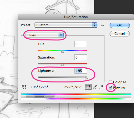 | ||
Scan drawing in RGB color mode. Cmd-U for Hue/Saturation, set to
Blues, move Lightness slider to the right, then do the same for Cyan. This will drop out the blue pencil. Make sure to select Preview. |
 |
Drawing after Hue/Saturation adjustment. I also knock out the paper tone
using Levels (cmd-L): Click the white Eye Dropper on the paper tone.
|
 |
I set drawing Layer's Blending Mode to Multiply (see Layer
Panel a few images below). Underneath that Layer I added a scan of sienna oil paint over gessoed board (and wiped-out to bring out brush strokes). |
 |
Shadow Layer, painted in a cool gray, Blending Mode set to
Multiply (which preserves texture of Layer underneath). |
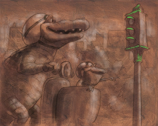 |
| Lighter areas created by painting a light color on a Layer with the Blending Mode set to Color Dodge. |
 |
| Local color painted on a top Layer with Blending Mode set to Color. This completes the "underpainting" part of the process. |
 |
| This is the Layer set-up for the "underpainting." The Blending Modes that I used for the first few steps (Multiply, Color Dodge, Color) will preserve the texture of the oil wipe-out scan that is on the bottom ("Base Texture"). |
 |
| Now I'm adding opaque details on Layers set to Normal Blending Mode. |
 |
| Here's the final. Click image to enlarge. |
 |
| Final Layer set-up. I merged the Layers from the beginning "underpainting"steps. Noticed the masked Layer of haze that I created to give some atmospheric background. I lowered the Opacity of that Layer. |
 |
| Here are some of my favorite custom Brushes, created mainly by attaching scanned textures to the Spatter Brush and then making adjustments through the Brush Panel (F5). I generally use these Brushes to paint opaquely on Layers set to Normal (Blending Mode). I use the "Conté on watercolor paper" Brush to smooth out focal points. |

