 |
| Pentel Pocket Brush, Kuretake Brush Pen, Pro White, over blue pencil drawing. |

David Opie Illustration
Friday, October 3, 2014
Inktober: Day 3
Robot drawing. There will be more ...
Thursday, October 2, 2014
Inktober: Day 2
I wanted to practice foliage for today's Inktober drawing.
 |
| Pentel Pocket Brush, Kuretake Brush Pen, blue pencil underdrawing. Click to enlarge. |
Wednesday, October 1, 2014
Inktober: Day 1
I plan on participating in Inktober, which is doing one ink drawing a day through October, mainly for practice. Here's the first one. I think the subsequent ones will be less involved ...

For more info about Inktober, check out Jake Parker's explanation (he's the dude who started it).
 |
| Brush, Higgins Black Magic Ink, Pro White, blue pencil underdrawing. Click to enlarge. |
For more info about Inktober, check out Jake Parker's explanation (he's the dude who started it).
Tuesday, September 30, 2014
"Walrus" Process
Earlier this year I illustrated an educational reading book called Where's the Walrus? I did the final drawings in ink on cold press watercolor paper, and then painted them in watercolors. I scanned the painting, adjusted the scan in Photoshop, and digitally added more contrast and detail.
Here's the final image:
Here's the painting before most of the digital manipulation:
I like to leave my raw scan on its own Layer and use Adjustment Layers (and Layer Masks to target the changes) to optimize the scan. To increase the shadows, I created a new Layer, set the Blending Mode to Multiply, and painted with a cool gray. I usually use a basic Spatter Brush for shadow areas. To lighten some areas, I painted on a Layer with the Blending Mode set to Lighten. You can also use Screen, if that gives you better results (try both to see). You also may want to lower the Layer Opacity to soften the effect. The final step is painting in highlights on a Normal (opaque) Layer with a textured Brush.
I used to touch up watercolor paintings with Stabilo CarbOthello pastel pencils and Rembrandt soft pastels, and that was the look that I was going for with this project. I did almost all of my digital retouching with just one custom Brush (Dave's Big Texture Chalk). The Brush did a good job of mimicking pastels on textured watercolor paper.
Here's the final image:
 |
| This is the final version. You can see that I increased the contrast and added details (mainly on the walrus). Click to enlarge. |
Here's the painting before most of the digital manipulation:
 |
| The scan with some color correction. Click to enlarge. |
I like to leave my raw scan on its own Layer and use Adjustment Layers (and Layer Masks to target the changes) to optimize the scan. To increase the shadows, I created a new Layer, set the Blending Mode to Multiply, and painted with a cool gray. I usually use a basic Spatter Brush for shadow areas. To lighten some areas, I painted on a Layer with the Blending Mode set to Lighten. You can also use Screen, if that gives you better results (try both to see). You also may want to lower the Layer Opacity to soften the effect. The final step is painting in highlights on a Normal (opaque) Layer with a textured Brush.
 |
| Here's my Layer set-up. I like to leave the scan on its own Layer and make my adjustments on their own Layers. |
 |
| Here's a detail. Click to enlarge. |
I used to touch up watercolor paintings with Stabilo CarbOthello pastel pencils and Rembrandt soft pastels, and that was the look that I was going for with this project. I did almost all of my digital retouching with just one custom Brush (Dave's Big Texture Chalk). The Brush did a good job of mimicking pastels on textured watercolor paper.
 |
| I created the Brush so that the texture gets bigger as the size of the Brush increases. Please see the right sidebar for more info on my Brush Collections. |
Tuesday, September 9, 2014
"Tiny Tug" Process
I did this illustration for an educational client earlier this year. There were ten illustrations in all.
I started with an ink drawing on paper. I scanned in "Black & White" mode to clean it up. Many of the elements were going to be animated, so I couldn't render the reflections in the water.
 |
| The ink drawing. Click any illustration to embiggen. |
 |
| I blocked in the sky on its own Layer. The line work is on a Layer with the Blending Mode set to Multiply. |
 |
| For the water, I painted a big swatch with watercolors, scanned it, and adjusted it for each of the ten illustrations in this book. Please see the Layer set-up screen shot at the end of this post. |
 |
| I added the clouds on their own Layer. I made a looping selection with the Lasso for the basic shape. |
 |
| I blocked in the cruise ship on its own Layer. I used a Brush with bristles to accentuate the contour. Please scroll toward the end of the post to see which custom Brushes I used. |
 |
| Here I've painted in the rest of the boats. I block in the shapes at 100% opacity (usually with different browns), then Lock the Transparent Pixels (see Layer Panel below). After that I render with custom, textured Brushes. |
 |
| The exhaust on its own Layer. |
 |
| Here's the illustration with no line. |
The client thought that I needed to pump up the colors, so I went through each Layer and made an adjustment: Image > Adjustment > Hue/Saturation; then increased the Saturation. After that I took my Brush, changed the Mode to Color (see screen shot near the bottom of this post), and painted brighter colors over some of the areas. Painting in Color Mode keeps the existing tonal values but just changes the color. You could also create a Layer, set the Blending Mode to Color, and paint on that. Because the client wanted specific elements grouped by Layer, it was easier to make adjustments to individual Layers.
 |
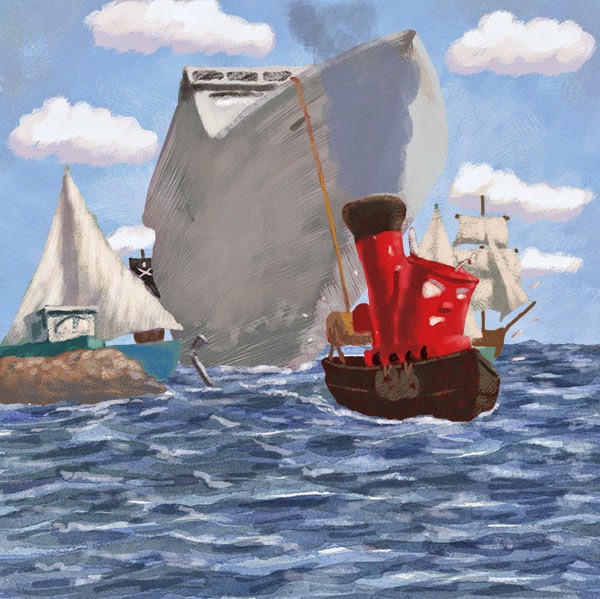
| Here's the final with pumped up color. |
 |
| Detail. Click to enlarge. |
 |
| An animated version. |
 |
| The Layer Panel. Click to enlarge. |
 |
| Here's where you change the Mode for the Brush. |
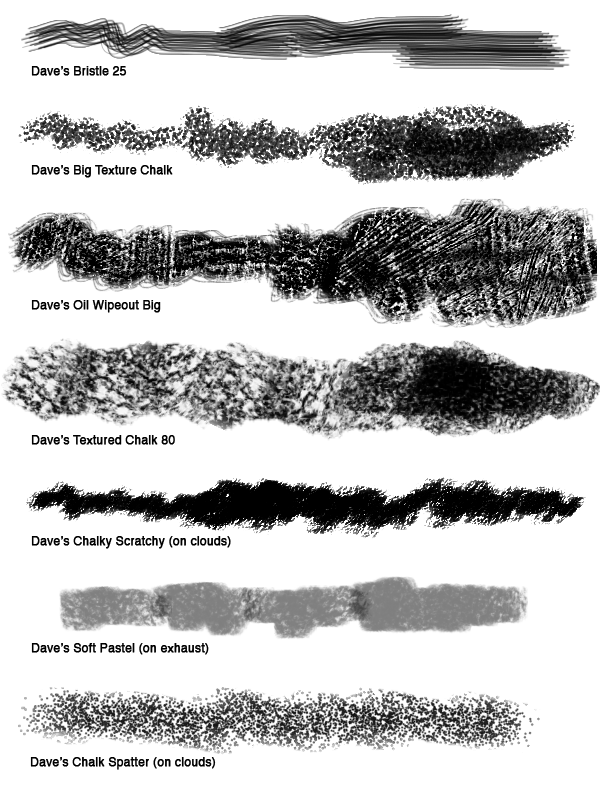 |
| These are the main custom Brushes that I used. They are included in the Wet and Dry Media Brush sets. Please see the sidebar for ordering info. |
Thursday, September 4, 2014
Beach Watercolors
Here are some watercolors that I did in a Moleskine book during a recent beach trip to SC.
 |
| Our beach house. Click any of these to enlarge. |
 |
| Paddleboarder. |
 |
| Dog in the shade. |
Monday, August 11, 2014
Blog Tour - "Froggie" Process
My crit group buddy Marcus Cutler has passed me the illustrator blog tour baton, so here goes:
I start with a blue pencil and do a loose drawing of basic shapes. I go over the blue pencil with graphite. Then I scan it in color and knock out the blue underdrawing using Hue/Saturation (cmd-U) as shown below, using the drop-down to target Cyans and Blues. I slide the Lightness all the way over to the right (+100) for each.
What am I currently working on?
Right now I am concentrating a picture book proposal that is inspired by fairy tales, but it's a different spin.
How does my work differ from others of its genre?
I tend to get hired for stories that require expressive animal characters.
Why do I write what I write? (or draw what I draw?)
Hey, those stories (and pictures) aren't going to create themselves!
How does my individual writing/illustrating process work?
I'm going to detail the process for a style sample that I recently did for an educational app developer.
I start with a blue pencil and do a loose drawing of basic shapes. I go over the blue pencil with graphite. Then I scan it in color and knock out the blue underdrawing using Hue/Saturation (cmd-U) as shown below, using the drop-down to target Cyans and Blues. I slide the Lightness all the way over to the right (+100) for each.
 |
| Hue and Saturation (cmd-U) |
I set the Layer Blending Mode for the drawings to Multiply. On a Layer underneath the drawing, I paint in the entire background. I usually block in everything with a standard Spatter Brush, then paint in detail and highlights with a custom textured Brush. I block in the frog at 100% Opacity on its own Layer (under the drawing). I carefully go over the shape, using the drawing as a guide. I usually use a brown midtown color. Next I click the "Lock Transparent Pixels" (see below) button on the Layer Panel and paint in the frog. I like to do this so that I don't have to make selections during the painting process. This will give me sharp edges, so I need to make sure to soften some edges later on.
Here's a snapshot of the Layers:
 |
| Layer Panel. You can see that I added a Color Fill Layer to warm-up the frog color. the Layer Blending Mode is set to Soft Light (shown above), and I set the Layer Opacity to 45% (also shown above). Click to enlarge. |
I paint in the details and highlights with custom, textured Brushes. I often add a "Multiply" Layer to deepen the shadows (paint cool grays on a Layer set to the Multiply Blending Mode).
In this case I added an "Atmosphere" Layer to push back the background and give a foggy feel to the scene. I add a Color Fill Layer, choose a pale blue-green, then lower the Opacity. Because the frog is on his own Layer, I just have to place the "Atmosphere" Layer below the froggie Layer.
In this case I added an "Atmosphere" Layer to push back the background and give a foggy feel to the scene. I add a Color Fill Layer, choose a pale blue-green, then lower the Opacity. Because the frog is on his own Layer, I just have to place the "Atmosphere" Layer below the froggie Layer.
I always add a "Top" Layer to paint over some of the drawing, redraw certain areas, and add highlights.
I used a "Color Fill" Layer filled with a warm green-yellow to brighten up the frog. I tried different Layer Blending Modes but decided on "Soft Light."
Here's the final:
 |
| The final piece. Click to embiggen. |
Animated process:

Here's a detail:
I mostly use Brushes from my two collections: Wet and Dry Media. These are the ones that I used the most in this illustration:
Here's a detail:
 |
| Detail. Click to enlarge. |
I mostly use Brushes from my two collections: Wet and Dry Media. These are the ones that I used the most in this illustration:
 |
| These are from my Brush collections. Info is on the right sidebar. |
Who are you are passing the interview to?

Next up is another buddy from our SCBWI crit group, Helena Juhasz. Please click here for her post. She writes: "I am a children's book author-illustrator with a soft-spot for young children's graphic novels and picture books. I am also the Illustrator Co-ordinator for SCBWI Canada West. I love writing stories and following the characters into their worlds, through layers of paper, pencil and paint."
Subscribe to:
Posts (Atom)