Showing posts with label David Opie. Show all posts

Thursday, July 2, 2020

Process for "All the Birds in the World"


Set up: I always start with a pencil sketch on paper. I then add tone in Photoshop. I find it easier to compose a page with a tonal image (Figure 1). Once I feel like the composition is set, I'll do a tight pencil drawing on bristol board, which I shift to a warm brown in Photoshop (Figure 2). 

Then I drop in a background that I created traditionally, so that I have a good base with brushstrokes to build up from (Figure 3). I set the Layer Blending Mode of the drawing Layer to Multiply, so that the white of the paper becomes transparent. Then I change the color of the textured background to a sky blue using Hue/Saturation. The trick at this point is to make sure to check the "Colorize" box (Figure A) before using the Hue slider.

Coloring the foreground: The next step is to block in the shapes in a process called "flatting" (named because I'm just painting in solid "flat" shapes) at 100% opacity, usually in a brown hue (Figure 4).

I create a Layer just above the background texture to paint in more textures and clouds (Figure 5). Putting this on its own Layer allows me to adjust the Layer Transparency to blend in the effects. 

Once I've blocked in all the shapes (the "flatting" I mentioned above) on the Layer below the drawing Layer, I'll check the "Lock Transparent Pixels" box on the Layers Panel (Figure B). That allows me to paint the shapes without making selections. It also gives me crisp edges, which I wanted for this book. I use plenty of photo reference for a book like this as I render the different forms. I usually block in the local color and basic areas with a default Brush, but then switch over to my custom Brushes to get more interesting textures and effects.

The last step is the details: I create a Layer above the drawing and paint in all the final touches with my Custom Brushes (Figure C). I have a library of my Brushes, plus I created a bunch of new ones to get some "feathery" effects just for this book. I'll also soften some of the edges so everything isn't so crisp and "cut-out" looking. By the time I'm finished, there's very little of the initial drawing still visible, but I consider the pencil drawing a vital part of the process.

A composite showing different stages of my process.

1. A rough pencil sketch with tone added in Photoshop.

2. Tight pencil sketch. I shift it to brown in Photoshop.

3. I set the Layer Blending Mode of the sketch to Multiply, and then drop
in a textured background that I created with traditional media. I then assign
a color to it using Hue/Saturation, making sure to check "Colorize."
See Figure A below.

4. The "flatting" stage.

5. I start adjusting the background by painting over it. 

6. I lock the transparent pixels (see Figure B below) and paint over the
brown "flatted" areas. The pencil Layer is still the
top Layer.

7. I create a top Layer, above the pencil sketch, and paint in the details.


A. I've circled the Colorize feature on the Hue and Saturation panel.
Make sure to check it and then adjust the Hue slider.

B. Check the circled icon to Lock Transparent Pixels. This will only let you
paint the areas you've blocked in.

C. These are some of the custom Brushes I used.

I animated the Layers (below). I paint over the "flatted" areas, so they don't show up in the video.


Please click here to order the book from bookshop.org and support local and independent bookstores.


Tuesday, September 30, 2014

"Walrus" Process

Earlier this year I illustrated an educational reading book called Where's the Walrus? I did the final drawings in ink on cold press watercolor paper, and then painted them in watercolors. I scanned the painting, adjusted the scan in Photoshop, and digitally added more contrast and detail.

Here's the final image:

This is the final version. You can see that I increased
the contrast and added details (mainly on the walrus).
Click to enlarge.


Here's the painting before most of the digital manipulation:

The scan with some color correction. Click to enlarge.


I like to leave my raw scan on its own Layer and use Adjustment Layers (and Layer Masks to target the changes) to optimize the scan. To increase the shadows, I created a new Layer, set the Blending Mode to Multiply, and painted with a cool gray. I usually use a basic Spatter Brush for shadow areas. To lighten some areas, I painted on a Layer with the Blending Mode set to Lighten. You can also use Screen, if that gives you better results (try both to see). You also may want to lower the Layer Opacity to soften the effect. The final step is painting in highlights on a Normal (opaque) Layer with a textured Brush.

Here's my Layer set-up. I like to leave the scan on its own
Layer and make my adjustments on their own Layers.

Here's a detail. Click to enlarge.

I used to touch up watercolor paintings with Stabilo CarbOthello pastel pencils and Rembrandt soft pastels, and that was the look that I was going for with this project. I did almost all of my digital retouching with just one custom Brush (Dave's Big Texture Chalk). The Brush did a good job of mimicking pastels on textured watercolor paper.

I created the Brush so that the texture gets bigger as
the size of the Brush increases. Please see the right
sidebar for more info on my Brush Collections. 

Tuesday, September 9, 2014

"Tiny Tug" Process

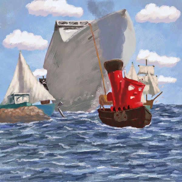
I did this illustration for an educational client earlier this year. There were ten illustrations in all.  

I started with an ink drawing on paper. I scanned in "Black & White" mode to clean it up. Many of the elements were going to be animated, so I couldn't render the reflections in the water.

The ink drawing. Click any illustration to embiggen.

I blocked in the sky on its own Layer. The line work is on a
Layer with the Blending Mode set to Multiply. 

For the water, I painted a big swatch with watercolors, scanned it,
and adjusted it for each of the ten illustrations in this book.
Please see the Layer set-up screen shot at the end of this post.

I added the clouds on their own Layer. I made a looping selection
with the Lasso for the basic shape.

I blocked in the cruise ship on its own Layer. I used a Brush with
bristles to accentuate the contour. Please scroll toward the end
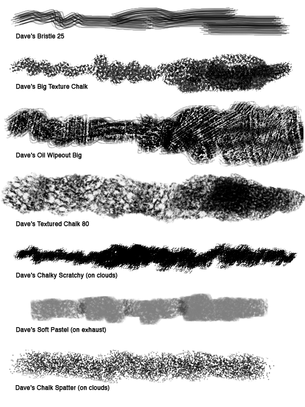
of the post to see which custom Brushes I used.

Here I've painted in the rest of the boats. I block in the shapes at
100% opacity (usually with different browns), then Lock the
Transparent Pixels (see Layer Panel below). After that I render
with custom, textured Brushes.

The exhaust on its own Layer.

Here's the illustration with no line.

The client thought that I needed to pump up the colors, so I went through each Layer and made an adjustment: Image > Adjustment > Hue/Saturation; then increased the Saturation. After that I took my Brush, changed the Mode to Color (see screen shot near the bottom of this post), and painted brighter colors over some of the areas. Painting in Color Mode keeps the existing tonal values but just changes the color. You could also create a Layer, set the Blending Mode to Color, and paint on that. Because the client wanted specific elements grouped by Layer, it was easier to make adjustments to individual Layers.


Here's the final with pumped up color.
                                     
Detail. Click to enlarge.

An animated version.


The Layer Panel. Click to enlarge.

Here's where you change the Mode for the Brush.

These are the main custom Brushes that I used. They are included in the
Wet and Dry Media Brush sets. Please see the sidebar for ordering info.

Thursday, September 4, 2014

Beach Watercolors

Here are some watercolors that I did in a Moleskine book during a recent beach trip to SC.

Our beach house. Click any of these to enlarge.

Paddleboarder.

Dog in the shade.


Monday, August 11, 2014

Blog Tour - "Froggie" Process

My crit group buddy Marcus Cutler has passed me the illustrator blog tour baton, so here goes:

What am I currently working on?
Right now I am concentrating a picture book proposal that is inspired by fairy tales, but it's a different spin.

How does my work differ from others of its genre?
I tend to get hired for stories that require expressive animal characters.

Why do I write what I write? (or draw what I draw?)
Hey, those stories (and pictures) aren't going to create themselves!

How does my individual writing/illustrating process work?
I'm going to detail the process for a style sample that I recently did for an educational app developer. 

I start with a blue pencil and do a loose drawing of basic shapes. I go over the blue pencil with graphite. Then I scan it in color and knock out the blue underdrawing using Hue/Saturation (cmd-U) as shown below, using the drop-down to target Cyans and Blues. I slide the Lightness all the way over to the right (+100) for each. 

Hue and Saturation (cmd-U)

I set the Layer Blending Mode for the drawings to Multiply. On a Layer underneath the drawing, I paint in the entire background. I usually block in everything with a standard Spatter Brush, then paint in detail and highlights with a custom textured Brush. I block in the frog at 100% Opacity on its own Layer (under the drawing). I carefully go over the shape, using the drawing as a guide. I usually use a brown midtown color. Next I click the "Lock Transparent Pixels" (see below) button on the Layer Panel and paint in the frog. I like to do this so that I don't have to make selections during the painting process. This will give me sharp edges, so I need to make sure to soften some edges later on. 

Here's a snapshot of the Layers:
Layer Panel. You can see that I added a Color Fill Layer to
warm-up the frog color. the Layer Blending Mode is set to
Soft Light (shown above), and I set the Layer Opacity to 45%
(also shown above). Click to enlarge.


I paint in the details and highlights with custom, textured Brushes. I often add a "Multiply" Layer to deepen the shadows (paint cool grays on a Layer set to the Multiply Blending Mode).

In this case I added an "Atmosphere" Layer to push back the background and give a foggy feel to the scene. I add a Color Fill Layer, choose a pale blue-green, then lower the Opacity. Because the frog is on his own Layer, I just have to place the "Atmosphere" Layer below the froggie Layer. 

I always add a "Top" Layer to paint over some of the drawing, redraw certain areas, and add highlights. 

I used a "Color Fill" Layer filled with a warm green-yellow to brighten up the frog. I tried different Layer Blending Modes but decided on "Soft Light."

Here's the final:
The final piece. Click to embiggen.
Animated process:

Here's a detail:
Detail. Click to enlarge.

I mostly use Brushes from my two collections: Wet and Dry Media. These are the ones that I used the most in this illustration:
These are from my Brush collections. Info is on the right sidebar.


Who are you are passing the interview to?

Next up is another buddy from our SCBWI crit group, Helena Juhasz. Please click here for her post. She writes: "I am a children's book author-illustrator with a soft-spot for young children's graphic novels and picture books. I am also the Illustrator Co-ordinator for SCBWI Canada West. I love writing stories and following the characters into their worlds, through layers of paper, pencil and paint."

Tuesday, July 29, 2014

Return to Sender

I was recently asked by my high school to write an essay for their "Four Columns" publication. I chose to focus on an unfortunate incident that occurred during my college application process.


I remember sitting in Spanish class the fall of my senior year at EHS. My mind started to drift away from irregular Spanish verbs as I daydreamed about being in art school the following year. I had recently sent in my application portfolio to the Rhode Island School of Design (RISD). The school required twenty slides of my work, plus three original pencil drawings: shoes, a bicycle, and a subject of my own choosing. The drawings had to be done in pencil on a 16 by 20 inch sheet of paper, and then folded twice. RISD provided the envelope that all the materials had to fit in. I spent a lot of time on those drawings, trying to get the details and shading just right. It was going to be so much fun to draw and paint all day in art school …

The class bell rang me back to reality. I gathered my books and went downstairs to check my mailbox. Waiting for me was a postcard. The return address indicated that it was from UPS. I flipped over the card and saw a long checklist. The top entry read “Your package was slightly damaged in transit but was delivered to the addressee.” I scanned down the list, which got progressively more tragic. It ended with “Your package was completely destroyed in the shipping process.” That last one had a check next to it, and the address for the RISD admissions office was written at the bottom of the card. It hit me: All those slides were destroyed, but worse, so were the original drawings. The application deadline had passed. I was devastated.

I showed the postcard to my art teacher, Mr. Lisanick (Mr. L), who calmed me down and said that he would call UPS to get more information. He talked to a UPS representative and was told that the envelope had gotten snagged and shredded by their conveyor belt. All that was left was a scrap of paper that had the addresses written on them, so at least UPS was able to let me know what happened. Mr. L then called RISD and got a two-week extension for my application. I was too upset the first day to get started on the drawings, but the next day I went to Mr. L’s class and got to work rendering that pair of old shoes. Mr. L gave me a lot of encouragement and helped me through that dark time.

My drawings were better the second time around, and I was accepted to RISD. Later, when I went to RISD for a tour, the admissions person read my name and said, “Aren’t you the one who had your admissions portfolio destroyed by UPS?” Everyone in the room gasped and looked at me. At least the episode made my application stick out from all the others.

I majored in illustration at RISD, and the experience was everything that I hoped it would be. I started doing freelance illustration for magazines and newspapers right out of school, but I also had plenty of art-related jobs along the way: designing t-shirts for a screen printer, doing educational illustration at a major publishing house, working for a graphic design firm in New York City, teaching college-level art in Chicago.

Ten years after graduating from RISD, I earned my master’s degree in illustration from the School of Visual Arts (SVA) in Manhattan. I used the time at grad school to refocus my portfolio on narrative work. When I graduated from SVA I had a portfolio of work geared toward children’s books, and I started to get work right away illustrating for educational publishers. I have illustrated close to twenty books—mostly educational readers—but also chapter books and an interactive storybook app that I also wrote.

I recently illustrated the picture book Dozer’s Run for Sleeping Bear Press. The story, written by Debbie Levy, is a true tale about Dozer, a dog who slips out of his yard, spontaneously joins a half marathon, and ends up running about the last eight miles. The annual race is a fund-raiser for the Greenebaum Cancer Center (part of the University of Maryland), and, when the press reported the story about Dozer’s joining the race, people from all over the world donated money on his behalf. Dozer ended up raising more money than any of the humans. I’ve become known for illustrating animal stories, and this was a fun one to work on.

In grad school we had a required writing class. After a few weeks of writing assignments, the teacher held meetings with individual students. At my meeting, the teacher said, “You write really well. Where did you go to college?”

“I went to RISD, but I placed out of English, so I didn’t do much writing in college. But my high school had a great English department, and that’s where I learned to write,” I replied. And that’s the direction that I’m going in next. I have written a couple of chapter books and picture books. I plan to hone those manuscripts and contact literary agents soon, and I’ll be sure to let the EHS community know what happens.

Wednesday, January 8, 2014

"Dozer" Character Design

I recently finished illustrating "Dozer's Run," a picture book to be published by Sleeping Bear Press (written by Debbie Levy and Rosana Panza). It is scheduled to be in May 2014. I guarantee that I will post more about this project as we get closer to the release date!

For now, here's a post about the character design and development of Dozer, the title character in this true story of a labradoodle who spontaneously took part in a fund-raiser half-marathon.

Click here for a Publisher's Weekly article about the book.

When I start a project, I focus on the characters. The first step is drawing; lots of drawing!

I do pages and pages of these. I use
photo reference, especially at first. Click to enlarge.
Action poses. Click any of
these images to enlarge.
I like to put the character in poses
from the book. I try to show action
and emotion from the beginning stages.

Once I get some poses that I like, I do color studies.

My color versions can also be process studies. I did all of these
color studies digitally,  although I go for a "traditional" look.

More color studies, but I've decided to go for
 an opaque, painted look.

Color studies. Yep, I do lots of studies. At this point I'm
starting to figure out Dozer's defining characteristics.
Dozer is getting closer to his final look.

More color studies in a technique that is
close to the final process.
Getting closer.

And in this cover detail you can see what I ended up with.
Here's a detail from a finished interior illustration.