Showing posts with label Photoshop tips. Show all posts

Thursday, July 2, 2020

Process for "All the Birds in the World"


Set up: I always start with a pencil sketch on paper. I then add tone in Photoshop. I find it easier to compose a page with a tonal image (Figure 1). Once I feel like the composition is set, I'll do a tight pencil drawing on bristol board, which I shift to a warm brown in Photoshop (Figure 2). 

Then I drop in a background that I created traditionally, so that I have a good base with brushstrokes to build up from (Figure 3). I set the Layer Blending Mode of the drawing Layer to Multiply, so that the white of the paper becomes transparent. Then I change the color of the textured background to a sky blue using Hue/Saturation. The trick at this point is to make sure to check the "Colorize" box (Figure A) before using the Hue slider.

Coloring the foreground: The next step is to block in the shapes in a process called "flatting" (named because I'm just painting in solid "flat" shapes) at 100% opacity, usually in a brown hue (Figure 4).

I create a Layer just above the background texture to paint in more textures and clouds (Figure 5). Putting this on its own Layer allows me to adjust the Layer Transparency to blend in the effects. 

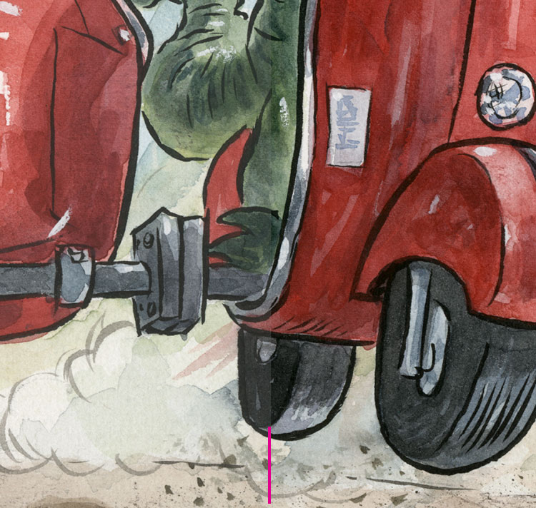
Once I've blocked in all the shapes (the "flatting" I mentioned above) on the Layer below the drawing Layer, I'll check the "Lock Transparent Pixels" box on the Layers Panel (Figure B). That allows me to paint the shapes without making selections. It also gives me crisp edges, which I wanted for this book. I use plenty of photo reference for a book like this as I render the different forms. I usually block in the local color and basic areas with a default Brush, but then switch over to my custom Brushes to get more interesting textures and effects.

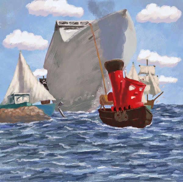
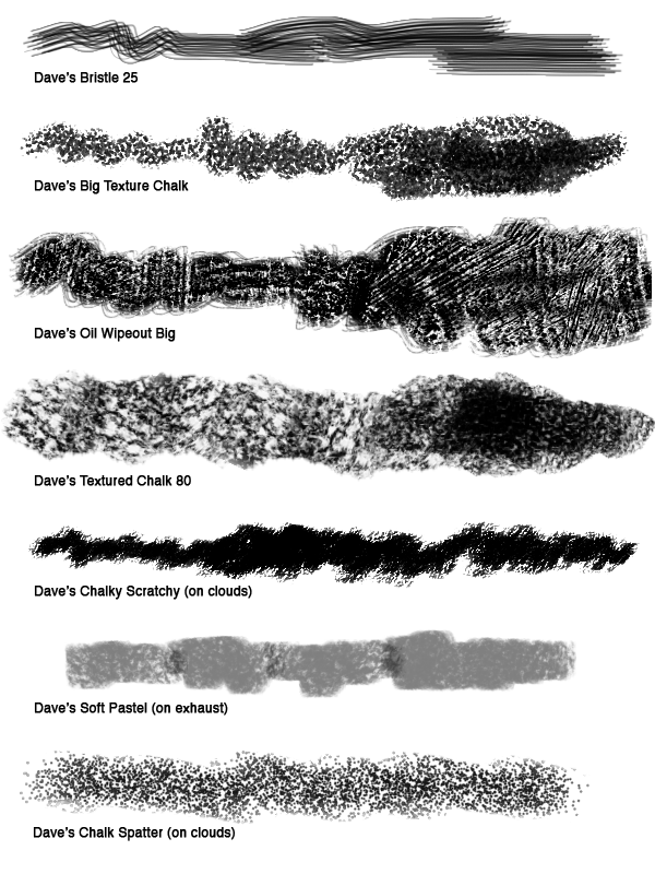
The last step is the details: I create a Layer above the drawing and paint in all the final touches with my Custom Brushes (Figure C). I have a library of my Brushes, plus I created a bunch of new ones to get some "feathery" effects just for this book. I'll also soften some of the edges so everything isn't so crisp and "cut-out" looking. By the time I'm finished, there's very little of the initial drawing still visible, but I consider the pencil drawing a vital part of the process.

A composite showing different stages of my process.

1. A rough pencil sketch with tone added in Photoshop.

2. Tight pencil sketch. I shift it to brown in Photoshop.

3. I set the Layer Blending Mode of the sketch to Multiply, and then drop
in a textured background that I created with traditional media. I then assign
a color to it using Hue/Saturation, making sure to check "Colorize."
See Figure A below.

4. The "flatting" stage.

5. I start adjusting the background by painting over it. 

6. I lock the transparent pixels (see Figure B below) and paint over the
brown "flatted" areas. The pencil Layer is still the
top Layer.

7. I create a top Layer, above the pencil sketch, and paint in the details.


A. I've circled the Colorize feature on the Hue and Saturation panel.
Make sure to check it and then adjust the Hue slider.

B. Check the circled icon to Lock Transparent Pixels. This will only let you
paint the areas you've blocked in.

C. These are some of the custom Brushes I used.

I animated the Layers (below). I paint over the "flatted" areas, so they don't show up in the video.


Please click here to order the book from bookshop.org and support local and independent bookstores.


Tuesday, March 5, 2019

Process for "There Was an Old Gator" Illustration


Here's a little peek behind the process I used for the illustrations in the picture book, "There Was an Old Gator Who Swallowed a Moth," written by B.J. Lee and produced by Pelican Publishing. I created the original art with dip pen and watercolors on Arches cold-pressed paper.

The final illustration.


It all starts with a pencil drawing. I add tone in Photoshop to create
a value study.

Here's the ink drawing on Arches cold-press watercolor paper. I use a light
table to trace my drawing. I mostly used a Hunt 101 nib.


Starting to lay in the background.


The background is just about blocked in.


Building up the animals in the foreground.


This is my raw scan before I adjust the colors in Photoshop to better match the
painting and fix things up a little.

Here's my Layers Panel to show how much I adjust the scan. I select most major
colors (using the Magic Wand or Quick Selection Tool), Feather the selection about 5 pixels,
and then open up an Adjustment Layer. In this illustration I also copied and enlarged the
gator's left arm. Click to enlarge.


Tuesday, January 30, 2018

"Chicken Little" Illustration Process

I recently painted a scene from the "Chicken Little" story for an upcoming conference. Here's my process for the illustration.

Above is a composite, showing the three main stages: sketch, color study,
and final painting.
I start off by drawing the basic shapes with a blue pencil. I then go over the underdrawing with a soft lead pencil (see below). I can knock out the blue in Photoshop to clean up the drawing (cmd-U for Hue/Saturation, select Cyans and Blues, drag Lightness all the way over to the right). I print out my drawing at 100% final working size and use a light table to ink the drawing.

Sketch.

I find it helpful to do a color study. This one is about 9 by 7 inches (below).
Color study. Watercolor, ink, touches of pastel.
Below is the raw scan without color correction. The painting is about 13 by 10 inches. I didn't like the way Chicken Little turned out, so I painted a few more versions. I know I can always repaint areas and use Photoshop to combine the patched section. And sometimes I'll just start over and call the abandoned painting another "study."
Raw scan. Watercolor, ink, with touches of pastel and colored pencil.
Below are some alternate versions of Chicken Little. I find that I have more options in blending in the patched section if I paint in some background color. I don't want the patched section to look cut-out or have a white fringe around it.
I liked the middle one the best, so I dropped him into the final painting.
This is what my Layer Panel (below) looks like for the final piece. You can see Chicken Little is on his own Layer (labeled "Chicken"). I used Layer Masking to blend him in, then I made a composite Layer (cmd-option-shift-E) and used the Clone Stamp to blend him in more. Sometimes I do my Cloning on a Layer above the patched section. For more on how I adjust scan colors, please see this blog post, "Optimizing a Color Scan." The short version is that I select each color field (e.g. all the green grass), and then use a Color Balance Layer Adjustment. I do this for each major color while comparing it to the original painting.

Layer Panel.

And here's the final, optimized illustration with the new version of Chicken Little blended into the scene. I also use a Curves Adjustment Layer to increase the contrast (and better match the original painting).

The final, optimized illustration (with the replacement Chicken Little).

Tuesday, March 8, 2016

Optimizing a Scan, Part 2: Color Adjustment

This is a continuation of an earlier post in which I mainly adjusted the tone. In this post I'll cover color adjustment.

I have the original painting on an easel right next to the monitor so that I can easily compare the two (A below).

A. I put the original on an easel next to my monitor so that I can compare the two.
Click on any image to enlarge.


I then adjust the color balance in the image. I usually do this for each major color in the illustration. For example: the green in the gator will be one Adjustment Layer, the green in the background will be another, and the blue in the sky will have its own adjustment. There are several different ways to select the areas: Magic Wand, Quick Selection tool, or Lasso. I usually start with the Wand of Magic (hold down the "Shift" key to add to your selection area). I also like to Feather my selection before I make any changes (make selection, right-click, or Refine Edge, Feather at 5 pixels). See B below for Refine Edge. Feathering fades the selection area, which will prevent harsh lines along the edge of the selection.

B. With an active selection area and selection tool, Refine Edge is accessible
in the Menu and by right-clicking.


In the example below (see C), I selected for the green in the gator, Feathered the selection, then activated a Color Balance Adjustment Layer. Notice that the selection is converted into a Layer Mask when I open up a new Adjustment Layer. Then I adjust the sliders to match the original art. I repeat this for each major color in the piece.

C. Select for a color, Feather, add Color Balance Adjustment Layer.
Notice that the selection converts into a Layer Mask. You can modify the
Mask by painting white for areas you want the adjustment to affect or
black to mask the effect. You can even paint gray for more subtle adjustments.


A quick note about calibrating your monitor: I find it absolutely necessary to use a third-party monitor calibrator. I use the SpyderPro, which I highly recommend.

Adjustment Layers are considered "non-destructive." You can change the settings of the Adjustment Layer without harming the pixels of the original scan. Double-click on the first icon of the Adjustment Layer to pop-up the Properties Panel and tweak your settings. Please see D below.

D. Double-click the first icon to open up the
Properties panel so that you can adjust your settings.


As a final step, I often create a Hue/Saturation Adjustment Layer on the top to see if boosting the overall Saturation helps the image. If so, I'll keep it. If it doesn't make much difference, then I'll just undo it.

Tuesday, September 29, 2015

Optimizing a Scan, Part 1: Levels

In this post I’m going to cover my process for tweaking a color scan of an illustration. I’ll be making my editing decisions based on the file’s Histogram and by my monitor. In order to “trust” the image on my monitor, I make sure to keep it calibrated. I use the Spyder Pro for my monitor calibration, but there are other good systems out there.

My scanner is the Epson Expression 10000XL, which I highly recommend. It’s easy to use, captures lots of detail, and can scan up to 12 by 17 inches.

I start off by selecting “Professional Mode” with “No Color Corrections” (please see Figure A). I want to make all my adjustments in Photoshop—I don’t want the scanning software to make any of the decisions for me.

Figure A: The Epson interface.


I open up the scan in Photoshop and compare it to the original, which I prop up on an easel right next to my monitor as I tweak the file. I know from experience that my scanner tends to scan a little too light and the colors a little too flat. The first thing I do is open up a Levels Adjustment Layer (see screenshot B below), which is the non-destructive and more flexible alternative to using a Levels adjustment (cmd-L) directly on the pixel Layer.

B: Levels Adjustment Layer at the bottom of the Layers Panel.


As a side note, I tend to use Levels for scanned artwork and Curves for photographs. Curves will give you more control over the tonal adjustment because you can add points, but I’ve found that Levels is generally fine for scans.

When you open up a Levels Adjustment Layer, you’ll see the Histogram under the Properties Panel. The Histogram plots on a graph all the pixels in the image based on their tonal value (see screenshot C below). The illustration in this example shows a dark figure against a fairly large, light background. I used black ink for the line, so I want to make sure that the lines are dark black.

C: You can see the gap in the shadow area of the
original scan and the adjustment made by sliding the Black Point
over to close the gap. You can also see that most of the pixels
on the graph fall toward the lighter side, which is what
you'd expect with this image. 

When I look at the Histogram, I see that there’s a gap between the actual pixels in the scan and the Black Point (or darkest black), which is normal for my scanner. That ensures that I don’t lose detail in the darkest areas of my scan. I also see that my highlight areas extend all the way to the lightest tone, so I won’t need to adjust my highlights for this scan. I also notice that most of the pixels fall toward the highlights, which I’d expect with an image that has so much light background in it.

To correct for the shadows, I slide the Black Point (or Shadow) to the place where the pixels in the Histogram start (see C above). Whenever I make an adjustment, I always click on and off the Eyeball (to show and hide) for the Layer Adjustment to evaluate the change.

By moving the Black Point over to make up for the gap in the Histogram, I am making sure that my image will contain the full tonal range and not look washed-out (see D below). This will also make the colors a little more saturated.

D: Before Levels adjustment on the left, and after on the right.
Notice that the red is richer after the adjustment. Click to enlarge.


Next up: Optimizing a Scan, Part 2: Adjusting Color Balance and Hue/Saturation (to come).

Wednesday, June 10, 2015

Photoshop's Photomerge: Pt. 2

In my previous post, I demonstrated using Photomerge to create a panorama. Nowadays, if I want a panorama, I'll probably just use my iPhone, but I still use Photomerge to piece together parts of an illustration that I scanned in sections. I used to accomplish this the old-fashioned way: Using the Difference Layer Blending Mode and painstakingly rotating and tapping the image over pixel-by-pixel, but now I let Photoshop's Photomerge do all the work.

Click here to see my previous post, Photomerge Pt. 1.

There are a few things I do to prepare to use Photomerge in this way. First, I am careful that my illustration's edges are at right angles. To do this, when I trim the edges of my illustration, I use a transparent gridded rectangle against a cutting board with a grid on it. Then, in my scanner, I make sure to push an edge flush against the frame of the scanner glass. Although Photoshop can rotate the image a few degrees in Auto Blend, you'll get better image quality by avoiding this (Photoshop uses "interpolation" on images that aren't rotated at 90 degree increments, which will cause slight image degradation).

It's also important to give your image a couple inches of overlap. This gives Photoshop a margin to use in computing how to align the sections and gives room to create the Layer Mask.

I make sure that my paper edges are square and I include a
generous overlap. Click any image to enlarge.

Now, File > Automate > Photomerge. I use the default settings: Layout > Auto and I make sure the box is checked for Blend Images Together.

These are the default settings, and I use them to piece
together scans.

This screen shot shows the Layer Masks. 
I turned off one of the Layers to show the effect of the Layer Mask that
Photoshop generated.


I always check to make sure that Photomerge blended the section seamlessly. To do that, I hit cmd-1 (View > Actual Pixels) and then scroll around the seam. Once I'm satisfied with the merged sections, I'll flatten the image and start correcting the scan for color and tone, and that will be the topic of my next Photoshop Tips blog post.

Tuesday, December 9, 2014

Photoshop Brushes - Texture Modes

A Brush from my "Dry Media" Collection that I use a lot is the one I call Chalky Scratchy. It gives an effect like a hard pastel on a textured surface. I achieved this effect by attaching a texture to a Brush and trying different Texture Modes (found on the Brush Panel; please see screen shot A below).

Click here for my post about attaching a texture to a Brush.

One of the strengths of Photoshop is the ability to attach textures to Brushes, but many times the texture effect seems too soft. Applying different Texture Modes can increase the texture and give you a whole range of effects for you to use in your digital painting.


A. The Brush Panel. Texture Mode is highlighted in
the middle of the Panel. Click to enlarge.


The default setting for my Chalky Scratchy Brush is Color Burn, which can give a contrasty effect. The Multiply mode adds a lot of texture inside the stroke, while Overlay gives a softer effect. Hard Mix is similar to Color Burn but is more solid in the middle of the stroke. Please see the swatches below (screenshot B).

Try playing around with lots of Brushes and textures, because different combinations will give you different--and often, surprising--results. The Preview at the bottom of the Brush Panel will give you a good idea as to what you're going to get. And remember, if you find a new setting that you really like, click the New Brush button on the Brush Panel (bottom righthand corner; it looks like a page with the corner turned up; see screenshot A above) and save your new Brush.

B. Here are some different Texture Modes that gave good results with this Brush.
Click to enlarge.

Click here for more info about my Dry Media Collection.

Click here to buy the Dry Media Collection.

Tuesday, September 30, 2014

"Walrus" Process

Earlier this year I illustrated an educational reading book called Where's the Walrus? I did the final drawings in ink on cold press watercolor paper, and then painted them in watercolors. I scanned the painting, adjusted the scan in Photoshop, and digitally added more contrast and detail.

Here's the final image:

This is the final version. You can see that I increased
the contrast and added details (mainly on the walrus).
Click to enlarge.


Here's the painting before most of the digital manipulation:

The scan with some color correction. Click to enlarge.


I like to leave my raw scan on its own Layer and use Adjustment Layers (and Layer Masks to target the changes) to optimize the scan. To increase the shadows, I created a new Layer, set the Blending Mode to Multiply, and painted with a cool gray. I usually use a basic Spatter Brush for shadow areas. To lighten some areas, I painted on a Layer with the Blending Mode set to Lighten. You can also use Screen, if that gives you better results (try both to see). You also may want to lower the Layer Opacity to soften the effect. The final step is painting in highlights on a Normal (opaque) Layer with a textured Brush.

Here's my Layer set-up. I like to leave the scan on its own
Layer and make my adjustments on their own Layers.

Here's a detail. Click to enlarge.

I used to touch up watercolor paintings with Stabilo CarbOthello pastel pencils and Rembrandt soft pastels, and that was the look that I was going for with this project. I did almost all of my digital retouching with just one custom Brush (Dave's Big Texture Chalk). The Brush did a good job of mimicking pastels on textured watercolor paper.

I created the Brush so that the texture gets bigger as
the size of the Brush increases. Please see the right
sidebar for more info on my Brush Collections. 

Tuesday, September 9, 2014

"Tiny Tug" Process

I did this illustration for an educational client earlier this year. There were ten illustrations in all.  

I started with an ink drawing on paper. I scanned in "Black & White" mode to clean it up. Many of the elements were going to be animated, so I couldn't render the reflections in the water.

The ink drawing. Click any illustration to embiggen.

I blocked in the sky on its own Layer. The line work is on a
Layer with the Blending Mode set to Multiply. 

For the water, I painted a big swatch with watercolors, scanned it,
and adjusted it for each of the ten illustrations in this book.
Please see the Layer set-up screen shot at the end of this post.

I added the clouds on their own Layer. I made a looping selection
with the Lasso for the basic shape.

I blocked in the cruise ship on its own Layer. I used a Brush with
bristles to accentuate the contour. Please scroll toward the end
of the post to see which custom Brushes I used.

Here I've painted in the rest of the boats. I block in the shapes at
100% opacity (usually with different browns), then Lock the
Transparent Pixels (see Layer Panel below). After that I render
with custom, textured Brushes.

The exhaust on its own Layer.

Here's the illustration with no line.

The client thought that I needed to pump up the colors, so I went through each Layer and made an adjustment: Image > Adjustment > Hue/Saturation; then increased the Saturation. After that I took my Brush, changed the Mode to Color (see screen shot near the bottom of this post), and painted brighter colors over some of the areas. Painting in Color Mode keeps the existing tonal values but just changes the color. You could also create a Layer, set the Blending Mode to Color, and paint on that. Because the client wanted specific elements grouped by Layer, it was easier to make adjustments to individual Layers.


Here's the final with pumped up color.
                                     
Detail. Click to enlarge.

An animated version.


The Layer Panel. Click to enlarge.

Here's where you change the Mode for the Brush.

These are the main custom Brushes that I used. They are included in the
Wet and Dry Media Brush sets. Please see the sidebar for ordering info.