
In this post I’m going to cover my process for
tweaking a color scan of an illustration. I’ll be making my editing decisions
based on the file’s Histogram and by my monitor. In order to “trust” the image
on my monitor, I make sure to keep it calibrated. I use the Spyder Pro for my
monitor calibration, but there are other good systems out there.
My scanner is the Epson Expression 10000XL, which I highly
recommend. It’s easy to use, captures lots of detail, and can scan up to 12 by 17 inches.
I start off by selecting “Professional Mode” with “No Color
Corrections” (please see Figure A). I want to make all my adjustments in Photoshop—I don’t want the
scanning software to make any of the decisions for me.
 |
| Figure A: The Epson interface. |
I open up the scan in Photoshop and compare it to the
original, which I prop up on an easel right next to my monitor as I tweak the file. I know from
experience that my scanner tends to scan a little too light and the colors a little
too flat. The first
thing I do is open up a Levels Adjustment Layer (see screenshot B below), which is the
non-destructive and more flexible alternative to using a Levels
adjustment (cmd-L) directly on the pixel Layer.
 |
| B: Levels Adjustment Layer at the bottom of the Layers Panel. |
As a side note, I tend to use Levels for scanned artwork and
Curves for photographs. Curves will give you more control over the tonal
adjustment because you can add points, but I’ve found that Levels is generally
fine for scans.
When you open up a Levels Adjustment Layer, you’ll see the
Histogram under the Properties Panel. The Histogram plots on a graph all the pixels in
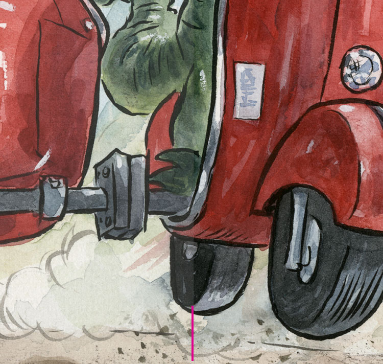
the image based on their tonal value (see screenshot C below). The
illustration in this example shows a dark figure against a fairly large, light
background. I used black ink for the line, so I want to make sure that the lines are dark black.
 |
| C: You can see the gap in the shadow area of the original scan and the adjustment made by sliding the Black Point over to close the gap. You can also see that most of the pixels on the graph fall toward the lighter side, which is what you'd expect with this image. |
When I look at the Histogram, I see that there’s a gap
between the actual pixels in the scan and the Black Point (or darkest black),
which is normal for my scanner. That ensures that I don’t lose detail in the
darkest areas of my scan. I also see that my highlight areas extend all the way
to the lightest tone, so I won’t need to adjust my highlights for this scan. I
also notice that most of the pixels fall toward the highlights, which I’d
expect with an image that has so much light background in it.
To correct for the shadows, I slide the Black Point (or
Shadow) to the place where the pixels in the Histogram start (see C above). Whenever I make
an adjustment, I always click on and off the Eyeball (to show and hide) for the
Layer Adjustment to evaluate the change.
By moving the Black Point over to make up for the gap in the
Histogram, I am making sure that my image will contain the full tonal range and not look washed-out (see D below).
This will also make the colors a little more saturated.
 |
| D: Before Levels adjustment on the left, and after on the right. Notice that the red is richer after the adjustment. Click to enlarge. |
Next up: Optimizing a Scan, Part 2: Adjusting Color Balance and Hue/Saturation (to come).
Related post: Piecing Together a Scan.
No comments:
Post a Comment