Showing posts with label process. Show all posts

Wednesday, June 30, 2021

Show at the Acton Memorial Library

 I have a show at the Acton Memorial Library (Acton, MA) that will be up in July and August (2021). I'm showing mostly prints from my debut author-illustrator picture book, "All the Birds in the World" (Peter Pauper Press, 2020), as well as some prints from my follow-up, "All the Fish in the World" (Peter Pauper Press, due August 2021). I've included links to buy at the bottom of this post.

Here's the original entrance of the historic
Acton Memorial Library (Massachusetts).


The first video shows the wall that showcases my process. I started off doing tons of designs of the main character, Kiwi. These are mainly ink and watercolor. The second bulletin board shows several ink and watercolor color studies I did. I was originally planning on doing the artwork traditionally--in ink and watercolor--but the art director and editor saw some of my digital work and asked me to do a sample spread in Photoshop. The digital art was more lush, detailed, and colorful, so we went with that. The third bulletin board shows my process from rough sketch to final (digital) art.


The main wall shows illustrations from "All the Birds in the World." The illustrations are pencil drawings that I painted in Photoshop. The last illustration on this wall is art from the book that I adapted into a jigsaw puzzle (sold by Peter Pauper Press).


The last wall displays work from "All the Fish in the World," due out August 2021. These are also pencil with digital color.


This last clip (below) shows a sweep of the full show.


You can buy "All the Birds in the World" (and support independent bookstores in the process) by buying from bookshop.org.

"All the Fish in the World" is not available yet, but I hear you can preorder it from Amazon. Sorry, no link.


"All the Fish" 1,000 piece jigsaw puzzle.

I am also selling framed and unframed prints from the Acton Memorial Library show. If interested, please email me (see my "Contact" page).

Thursday, July 2, 2020

Process for "All the Birds in the World"


Set up: I always start with a pencil sketch on paper. I then add tone in Photoshop. I find it easier to compose a page with a tonal image (Figure 1). Once I feel like the composition is set, I'll do a tight pencil drawing on bristol board, which I shift to a warm brown in Photoshop (Figure 2). 

Then I drop in a background that I created traditionally, so that I have a good base with brushstrokes to build up from (Figure 3). I set the Layer Blending Mode of the drawing Layer to Multiply, so that the white of the paper becomes transparent. Then I change the color of the textured background to a sky blue using Hue/Saturation. The trick at this point is to make sure to check the "Colorize" box (Figure A) before using the Hue slider.

Coloring the foreground: The next step is to block in the shapes in a process called "flatting" (named because I'm just painting in solid "flat" shapes) at 100% opacity, usually in a brown hue (Figure 4).

I create a Layer just above the background texture to paint in more textures and clouds (Figure 5). Putting this on its own Layer allows me to adjust the Layer Transparency to blend in the effects. 

Once I've blocked in all the shapes (the "flatting" I mentioned above) on the Layer below the drawing Layer, I'll check the "Lock Transparent Pixels" box on the Layers Panel (Figure B). That allows me to paint the shapes without making selections. It also gives me crisp edges, which I wanted for this book. I use plenty of photo reference for a book like this as I render the different forms. I usually block in the local color and basic areas with a default Brush, but then switch over to my custom Brushes to get more interesting textures and effects.

The last step is the details: I create a Layer above the drawing and paint in all the final touches with my Custom Brushes (Figure C). I have a library of my Brushes, plus I created a bunch of new ones to get some "feathery" effects just for this book. I'll also soften some of the edges so everything isn't so crisp and "cut-out" looking. By the time I'm finished, there's very little of the initial drawing still visible, but I consider the pencil drawing a vital part of the process.
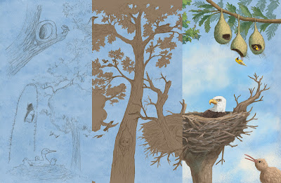
A composite showing different stages of my process.

1. A rough pencil sketch with tone added in Photoshop.

2. Tight pencil sketch. I shift it to brown in Photoshop.

3. I set the Layer Blending Mode of the sketch to Multiply, and then drop
in a textured background that I created with traditional media. I then assign
a color to it using Hue/Saturation, making sure to check "Colorize."
See Figure A below.

4. The "flatting" stage.

5. I start adjusting the background by painting over it. 

6. I lock the transparent pixels (see Figure B below) and paint over the
brown "flatted" areas. The pencil Layer is still the
top Layer.

7. I create a top Layer, above the pencil sketch, and paint in the details.


A. I've circled the Colorize feature on the Hue and Saturation panel.
Make sure to check it and then adjust the Hue slider.

B. Check the circled icon to Lock Transparent Pixels. This will only let you
paint the areas you've blocked in.

C. These are some of the custom Brushes I used.

I animated the Layers (below). I paint over the "flatted" areas, so they don't show up in the video.


Please click here to order the book from bookshop.org and support local and independent bookstores.


Wednesday, February 27, 2019

Process for "There Was an Old Gator Who Swallowed a Moth"

I made a short video showing my painting process for an illustration from my recent picture book. The book was written by B.J. Lee and produced by Pelican Publishing.

This is the final illustration done in ink and watercolor.
copyright © 2019 David Opie


Wednesday, January 8, 2014

"Dozer" Character Design

I recently finished illustrating "Dozer's Run," a picture book to be published by Sleeping Bear Press (written by Debbie Levy and Rosana Panza). It is scheduled to be in May 2014. I guarantee that I will post more about this project as we get closer to the release date!

For now, here's a post about the character design and development of Dozer, the title character in this true story of a labradoodle who spontaneously took part in a fund-raiser half-marathon.

Click here for a Publisher's Weekly article about the book.

When I start a project, I focus on the characters. The first step is drawing; lots of drawing!

I do pages and pages of these. I use
photo reference, especially at first. Click to enlarge.
Action poses. Click any of
these images to enlarge.
I like to put the character in poses
from the book. I try to show action
and emotion from the beginning stages.

Once I get some poses that I like, I do color studies.

My color versions can also be process studies. I did all of these
color studies digitally,  although I go for a "traditional" look.

More color studies, but I've decided to go for
 an opaque, painted look.

Color studies. Yep, I do lots of studies. At this point I'm
starting to figure out Dozer's defining characteristics.
Dozer is getting closer to his final look.

More color studies in a technique that is
close to the final process.
Getting closer.

And in this cover detail you can see what I ended up with.
Here's a detail from a finished interior illustration.

Monday, November 25, 2013

"Robot" Process

For this illustration, I scanned a pencil drawing and dropped a scan of a watercolor wash underneath it. By setting the Layer Blending Mode of the drawing to Multiply, the white of the paper becomes transparent, so the Layers underneath show through and the pixels on that Layer are added to the tones of the Layers underneath. I then added tone to the background and figure by painting gray on Layers with the Blending Modes set to Multiply. Next, I used a textured Brush to block in the lighter areas (with the Layer Blending Mode set to Normal). Click on the images to enlarge.

Here's the finished "Evil Robot" illustration.

It all starts with a pencil drawing.
Watercolor texture.

A composite of the drawing and watercolor wash. I've
started adding tone by painting on Multiply Layers.
Painting in the tones of the robot on a Multiply Layer.

I've started blocking in the robot with opaque Layers
(Blending Mode set to Normal).
I wanted to use a limited color palette, so I created a Color Fill Layer and set the Blending Mode to Color (which tints all Layers underneath). Then I added another Layer with the Blending Mode set to Color and painted with a rusty brown just on the areas with the robot and the ground (to contrast with the cooler blue-green of the background). And above those Layers, I added details and highlights with my custom Brushes on Layers with the Blending Mode set to Normal (so that the pixels are opaque). Please see the Layer screen shot below. Click on the images to enlarge.

Here's where you find the Fill and Adjustment Layers.

When you set a Color Fill Layer's Blending Mode to
Color, then the tones are preserved but the color shifts.
I added the warmer tones by painting on another Color Layer.
The Layer set-up with Blending Modes listed. Click to enlarge.

Detail. Click to enlarge.

Detail. Click to enlarge.

I used two custom Brushes for this illustration (see below). The top one is based on a standard "Chalk" Photoshop Brush found in the Dry Media collection, but I used my own texture and tweaked the settings. For the bottom Brush, I spattered watercolor on paper, scanned it, tiled it, and attached it to a Brush (please see link below). I can adjust the Scale of the texture on the Brush Panel as I paint.


These are the two main Brushes that I used. I've indicated
where you can adjust the Scale of the texture. Click to enlarge.

Please click here to buy my Dry Media Brush collection.
Click here to buy my Wet Media Brush collection.
Click here to see my blog post Attaching a Texture to a Brush.