Thursday, March 14, 2019

"Gator Day" Photos, Part 2

Here are a few more photos from "Gator Day" at Boyd Hill Nature Preserve (in St. Petersburg, FL)  that B.J. Lee (the author) and I participated in. We had a lot of fun presenting our book, There Was an Old Gator Who Swallowed a Moth. We did a presentation, took questions, signed books, and raffled off prizes.

Here I am, answering questions and bending my arm.

A raffle winner taking home a "Gator" coloring book.

More raffle winners.

Signing books (and drawing a picture inside).

Here's the raffle winner for the large drawing I did.
She was planning to frame the drawing and give it as a
baby shower gift.

Wednesday, March 13, 2019

"Gator Day" Book Event, Part 1

On Sunday, March 10th, the author, B.J. Lee, and I participated in Boyd Hill Nature Preserve's (in St. Petersburg, FL) "Gator Day." B.J. performed a reading (actually, she had memorized the text), I drew a gator, we had a Q&A, there was a crafts table, a gator watch/walk led by a very knowledgeable park ranger, book signing, a raffle...and many other activities. The Boyd Hill Nature Preserve was a wonderful setting for our book event and we're grateful to them for letting us participate.

Here I am with B.J. Lee.

Signing books before the presentation.

The crafts tables were a big hit. 
B.J. captivating the audience with her performance. And, yes,
I showed off my team spirit by donning a "gator" hat during
the presentation.

Here I am drawing the book's main character.

Tuesday, March 5, 2019

Process for "There Was an Old Gator" Illustration


Here's a little peek behind the process I used for the illustrations in the picture book, "There Was an Old Gator Who Swallowed a Moth," written by B.J. Lee and produced by Pelican Publishing. I created the original art with dip pen and watercolors on Arches cold-pressed paper.

The final illustration.


It all starts with a pencil drawing. I add tone in Photoshop to create
a value study.

Here's the ink drawing on Arches cold-press watercolor paper. I use a light
table to trace my drawing. I mostly used a Hunt 101 nib.


Starting to lay in the background.


The background is just about blocked in.


Building up the animals in the foreground.


This is my raw scan before I adjust the colors in Photoshop to better match the
painting and fix things up a little.

Here's my Layers Panel to show how much I adjust the scan. I select most major
colors (using the Magic Wand or Quick Selection Tool), Feather the selection about 5 pixels,
and then open up an Adjustment Layer. In this illustration I also copied and enlarged the
gator's left arm. Click to enlarge.


Wednesday, February 27, 2019

Process for "There Was an Old Gator Who Swallowed a Moth"

I made a short video showing my painting process for an illustration from my recent picture book. The book was written by B.J. Lee and produced by Pelican Publishing.

This is the final illustration done in ink and watercolor.
copyright © 2019 David Opie


Tuesday, January 30, 2018

"Chicken Little" Illustration Process

I recently painted a scene from the "Chicken Little" story for an upcoming conference. Here's my process for the illustration.

Above is a composite, showing the three main stages: sketch, color study,
and final painting.
I start off by drawing the basic shapes with a blue pencil. I then go over the underdrawing with a soft lead pencil (see below). I can knock out the blue in Photoshop to clean up the drawing (cmd-U for Hue/Saturation, select Cyans and Blues, drag Lightness all the way over to the right). I print out my drawing at 100% final working size and use a light table to ink the drawing.

Sketch.

I find it helpful to do a color study. This one is about 9 by 7 inches (below).
Color study. Watercolor, ink, touches of pastel.
Below is the raw scan without color correction. The painting is about 13 by 10 inches. I didn't like the way Chicken Little turned out, so I painted a few more versions. I know I can always repaint areas and use Photoshop to combine the patched section. And sometimes I'll just start over and call the abandoned painting another "study."
Raw scan. Watercolor, ink, with touches of pastel and colored pencil.
Below are some alternate versions of Chicken Little. I find that I have more options in blending in the patched section if I paint in some background color. I don't want the patched section to look cut-out or have a white fringe around it.
I liked the middle one the best, so I dropped him into the final painting.
This is what my Layer Panel (below) looks like for the final piece. You can see Chicken Little is on his own Layer (labeled "Chicken"). I used Layer Masking to blend him in, then I made a composite Layer (cmd-option-shift-E) and used the Clone Stamp to blend him in more. Sometimes I do my Cloning on a Layer above the patched section. For more on how I adjust scan colors, please see this blog post, "Optimizing a Color Scan." The short version is that I select each color field (e.g. all the green grass), and then use a Color Balance Layer Adjustment. I do this for each major color while comparing it to the original painting.

Layer Panel.

And here's the final, optimized illustration with the new version of Chicken Little blended into the scene. I also use a Curves Adjustment Layer to increase the contrast (and better match the original painting).

The final, optimized illustration (with the replacement Chicken Little).

Tuesday, October 11, 2016

Inktober 2016, First Ten Days

© 2016 David Opie 
© 2016 David Opie 
© 2016 David Opie
© 2016 David Opie 
© 2016 David
"Sad" 
© 2016 David Opie
"Hidden" 
© 2016 David Opie
"Lost" 
© 2016 David Opie
"Rock"  
© 2016 David Opie
"Broken"  
© 2016 David Opie
"Jump"

Tuesday, March 8, 2016

Optimizing a Scan, Part 2: Color Adjustment

This is a continuation of an earlier post in which I mainly adjusted the tone. In this post I'll cover color adjustment.

I have the original painting on an easel right next to the monitor so that I can easily compare the two (A below).

A. I put the original on an easel next to my monitor so that I can compare the two.
Click on any image to enlarge.


I then adjust the color balance in the image. I usually do this for each major color in the illustration. For example: the green in the gator will be one Adjustment Layer, the green in the background will be another, and the blue in the sky will have its own adjustment. There are several different ways to select the areas: Magic Wand, Quick Selection tool, or Lasso. I usually start with the Wand of Magic (hold down the "Shift" key to add to your selection area). I also like to Feather my selection before I make any changes (make selection, right-click, or Refine Edge, Feather at 5 pixels). See B below for Refine Edge. Feathering fades the selection area, which will prevent harsh lines along the edge of the selection.

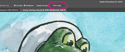
B. With an active selection area and selection tool, Refine Edge is accessible
in the Menu and by right-clicking.


In the example below (see C), I selected for the green in the gator, Feathered the selection, then activated a Color Balance Adjustment Layer. Notice that the selection is converted into a Layer Mask when I open up a new Adjustment Layer. Then I adjust the sliders to match the original art. I repeat this for each major color in the piece.

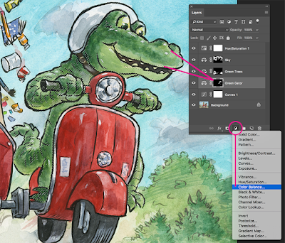
C. Select for a color, Feather, add Color Balance Adjustment Layer.
Notice that the selection converts into a Layer Mask. You can modify the
Mask by painting white for areas you want the adjustment to affect or
black to mask the effect. You can even paint gray for more subtle adjustments.


A quick note about calibrating your monitor: I find it absolutely necessary to use a third-party monitor calibrator. I use the SpyderPro, which I highly recommend.

Adjustment Layers are considered "non-destructive." You can change the settings of the Adjustment Layer without harming the pixels of the original scan. Double-click on the first icon of the Adjustment Layer to pop-up the Properties Panel and tweak your settings. Please see D below.

D. Double-click the first icon to open up the
Properties panel so that you can adjust your settings.


As a final step, I often create a Hue/Saturation Adjustment Layer on the top to see if boosting the overall Saturation helps the image. If so, I'll keep it. If it doesn't make much difference, then I'll just undo it.