

David Opie Illustration
Saturday, December 21, 2013
Monday, November 25, 2013
"Robot" Process
For this illustration, I scanned a pencil drawing and dropped a scan of a watercolor wash underneath it. By setting the Layer Blending Mode of the drawing to Multiply, the white of the paper becomes transparent, so the Layers underneath show through and the pixels on that Layer are added to the tones of the Layers underneath. I then added tone to the background and figure by painting gray on Layers with the Blending Modes set to Multiply. Next, I used a textured Brush to block in the lighter areas (with the Layer Blending Mode set to Normal). Click on the images to enlarge.
I wanted to use a limited color palette, so I created a Color Fill Layer and set the Blending Mode to Color (which tints all Layers underneath). Then I added another Layer with the Blending Mode set to Color and painted with a rusty brown just on the areas with the robot and the ground (to contrast with the cooler blue-green of the background). And above those Layers, I added details and highlights with my custom Brushes on Layers with the Blending Mode set to Normal (so that the pixels are opaque). Please see the Layer screen shot below. Click on the images to enlarge.
I used two custom Brushes for this illustration (see below). The top one is based on a standard "Chalk" Photoshop Brush found in the Dry Media collection, but I used my own texture and tweaked the settings. For the bottom Brush, I spattered watercolor on paper, scanned it, tiled it, and attached it to a Brush (please see link below). I can adjust the Scale of the texture on the Brush Panel as I paint.
Please click here to buy my Dry Media Brush collection.
Click here to buy my Wet Media Brush collection.
Click here to see my blog post Attaching a Texture to a Brush.
 |
| Here's the finished "Evil Robot" illustration. |
 |
| It all starts with a pencil drawing. |
 |
| Watercolor texture. |
 |
| A composite of the drawing and watercolor wash. I've started adding tone by painting on Multiply Layers. |
 |
| Painting in the tones of the robot on a Multiply Layer. |
 |
| I've started blocking in the robot with opaque Layers (Blending Mode set to Normal). |
 |
| Here's where you find the Fill and Adjustment Layers. |
 |
| When you set a Color Fill Layer's Blending Mode to Color, then the tones are preserved but the color shifts. |
 |
| I added the warmer tones by painting on another Color Layer. |
 |
| The Layer set-up with Blending Modes listed. Click to enlarge. |
 |
| Detail. Click to enlarge. |
 |
| Detail. Click to enlarge. |
I used two custom Brushes for this illustration (see below). The top one is based on a standard "Chalk" Photoshop Brush found in the Dry Media collection, but I used my own texture and tweaked the settings. For the bottom Brush, I spattered watercolor on paper, scanned it, tiled it, and attached it to a Brush (please see link below). I can adjust the Scale of the texture on the Brush Panel as I paint.
 |
| These are the two main Brushes that I used. I've indicated where you can adjust the Scale of the texture. Click to enlarge. |
Please click here to buy my Dry Media Brush collection.
Click here to buy my Wet Media Brush collection.
Click here to see my blog post Attaching a Texture to a Brush.
Friday, November 22, 2013
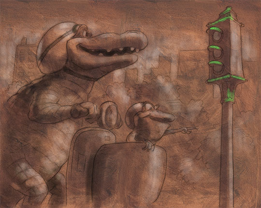
Evil Robot

Here's a sketch that I decided to develop. Pencil with digital color, with scanned textures.
Thursday, September 26, 2013
Making Your Own Photoshop Brushes
One of the things that I love about Photoshop is its flexibility; you can customize just about anything. In a previous post I showed some of the great Brushes that come in the CS6 default libraries. In this post, I'm going to show you how to make your own. I tend to use my own custom Brushes for most of my digital illustrations.
Here are 3 ways to get started (see screen shots below):
1. Take different media and make some sample marks. Scan them at 300 ppi, grayscale.
2. Get some photo samples. I selected some irregular, textured ones.
3. Make your own marks in Photoshop. In the example below I spaced out some dots (1 to 3 pixels, solid black) to get a brushstroke effect.
Note: You can also use text that you created with your Text tool.
With all of these approaches, make sure to go into Levels (cmd-L) and slide the Black Point to the right so that you have lots of areas of 100% black. If you don't, then you can't paint 100% of the Foreground Color with the Brush that you generate from the original shape. It's fine to have some gray areas.
Once you have your shape, use the Lasso to select it. The shape that you Lasso is important, because it will be your Brush shape. For the photographic textures (#2 above), you may want to erase away so that it leaves an interesting shape to create your Brush from.
With the Selection still active, go to Edit (Menu) > Define Brush Preset and give your new Brush a name. I usually begin the name with "My" (like "My Bristle Brush") so that I know that it's one that I created.
Here are 3 ways to get started (see screen shots below):
1. Take different media and make some sample marks. Scan them at 300 ppi, grayscale.
2. Get some photo samples. I selected some irregular, textured ones.
3. Make your own marks in Photoshop. In the example below I spaced out some dots (1 to 3 pixels, solid black) to get a brushstroke effect.
Note: You can also use text that you created with your Text tool.
With all of these approaches, make sure to go into Levels (cmd-L) and slide the Black Point to the right so that you have lots of areas of 100% black. If you don't, then you can't paint 100% of the Foreground Color with the Brush that you generate from the original shape. It's fine to have some gray areas.
 |
| 1. Scanned textures that I created traditionally. Click any image to enlarge. |
 |
| 2. Photographic textures. |
 |
| 3. Bristle textures that I created in Photoshop. |
Once you have your shape, use the Lasso to select it. The shape that you Lasso is important, because it will be your Brush shape. For the photographic textures (#2 above), you may want to erase away so that it leaves an interesting shape to create your Brush from.
 |
| Draw around your Brush shape with the Lasso. |
With the Selection still active, go to Edit (Menu) > Define Brush Preset and give your new Brush a name. I usually begin the name with "My" (like "My Bristle Brush") so that I know that it's one that I created.
And congratulations! That's the first big step in creating your own Photoshop Brush. When you go to the Brush Presets (with the Brush active: right-click, control-click; or Brush Presets in Menu or Brush Panel) it will show up at the end of the list.
One important thing to realize is that you get very different results when you take a Brush generated from a textured source (like the photographic textures above) and click-and-release (like a "dab") versus click-drag-release. The "click-and-release" method preserves the texture, the click-drag-release doesn't.
 |
| Top: Click-release Bottom: Click-drag-release |
Of course, you're not finished. I'll cover using the Brush Panel to modify your custom Brush and to add effects (and to fix the Spacing issue).
Monday, August 12, 2013
"Let's Go, Murray!" Process
This is the basic process that I used for the artwork for the app "Let's Go, Murray!" I am using Photoshop CS6. Each illustration took about a day-and-a-half of studio time to render (after scanning in the drawing). Click on any image to enlarge.
Click here to see a preview of "Let's Go, Murray!"
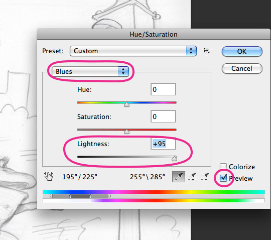 | ||
Scan drawing in RGB color mode. Cmd-U for Hue/Saturation, set to
Blues, move Lightness slider to the right, then do the same for Cyan. This will drop out the blue pencil. Make sure to select Preview. |

 |
Drawing after Hue/Saturation adjustment. I also knock out the paper tone
using Levels (cmd-L): Click the white Eye Dropper on the paper tone.
|
 |
I set drawing Layer's Blending Mode to Multiply (see Layer
Panel a few images below). Underneath that Layer I added a scan of sienna oil paint over gessoed board (and wiped-out to bring out brush strokes). |
 |
Shadow Layer, painted in a cool gray, Blending Mode set to
Multiply (which preserves texture of Layer underneath). |
 |
| Lighter areas created by painting a light color on a Layer with the Blending Mode set to Color Dodge. |
 |
| Local color painted on a top Layer with Blending Mode set to Color. This completes the "underpainting" part of the process. |
 |
| This is the Layer set-up for the "underpainting." The Blending Modes that I used for the first few steps (Multiply, Color Dodge, Color) will preserve the texture of the oil wipe-out scan that is on the bottom ("Base Texture"). |
 |
| Now I'm adding opaque details on Layers set to Normal Blending Mode. |
 |
| Here's the final. Click image to enlarge. |
 |
| Final Layer set-up. I merged the Layers from the beginning "underpainting"steps. Noticed the masked Layer of haze that I created to give some atmospheric background. I lowered the Opacity of that Layer. |
 |
| Here are some of my favorite custom Brushes, created mainly by attaching scanned textures to the Spatter Brush and then making adjustments through the Brush Panel (F5). I generally use these Brushes to paint opaquely on Layers set to Normal (Blending Mode). I use the "Conté on watercolor paper" Brush to smooth out focal points. |
Tuesday, June 25, 2013
Photoshop Brushes: Brush Panel
In my previous posts, I covered the Brush Presets, which are a permanent library of Brushes. The Brush Panel gives the digital painter ways to temporarily modify the Presets. Of course, if you find a good combination of Brush and settings, you can save the Brush into your Preset library (hit the New Brush icon on the Brush Panel; it's the graphic of the page with the corner turned up, bottom righthand corner). In this post I'm going to highlight some of the features on the Brush Panel.
To get started, choose a Brush (hit the "B" key) and open up the Brush Panel (F5).
The top button ("Brush Presets") is yet another way to access the Photoshop Brush library.
Click "Brush Tip Shape." Here you can adjust size and angle, but also check out "Spacing."Move the slider to the right and you can see how Photoshop's Brush Engine works: It's taking a shape and repeating that shape to create the effect of a brush stroke. The Bristle Brushes, introduced in CS5, actually track individual bristles, which is why the Bristle Brushes are a great feature for us painters.
Now click on "Shape Dynamics." If you're using a pressure-sensitive tablet (like a Wacom), make sure to select "Pen Pressure." I have to admit that I often paint with my Wacom Intuos4 and turn off the pressure sensitivity. However, if I'm drawing a line in Photoshop or touching up a pencil drawing, then I'll turn on the "Pen Pressure."
The "Scattering" option, the next one under "Shape Dynamics," breaks up the otherwise smooth flow of the shapes in the brush stroke. Adding a little Scattering can give the effect of drawing on a slightly textured surface. If you add in some pressure-sensitivity, then you have a line with some character!
The "Texture" controls (see graphic below) are very important in creating custom Brushes and making your digital work look textured and organic. So important, in fact, that I covered this feature in more detail in a previous blog post.
There are some decent textures in the Photoshop library, but I tend to make my own (which I also covered in the "Adding Texture to a Brush" post). For one thing, I don't think that the Photoshop preset textures tile well; the swatches are too small. However, you should still load and try out some of them (see below):
As a footnote, I'd like to show the difference between Brush Opacity and Flow in the screen shot below. The top stroke is 50% Opacity, which is a solid stroke of 50% of the foreground color (which in this case is black). The bottom stroke is at 50% Flow. You can see that Flow affects the rate of this repeating shape. I talk about the Spacing (and that repeating shape) in the first part of this post. I usually leave Flow alone and just adjust Opacity.
To get started, choose a Brush (hit the "B" key) and open up the Brush Panel (F5).
The top button ("Brush Presets") is yet another way to access the Photoshop Brush library.
Click "Brush Tip Shape." Here you can adjust size and angle, but also check out "Spacing."Move the slider to the right and you can see how Photoshop's Brush Engine works: It's taking a shape and repeating that shape to create the effect of a brush stroke. The Bristle Brushes, introduced in CS5, actually track individual bristles, which is why the Bristle Brushes are a great feature for us painters.
 |
Open up the Spacing to see how the brush stroke
is generated. I usually leave the spacing all the
way to the left for actual painting. (Click any image to enlarge). |
Now click on "Shape Dynamics." If you're using a pressure-sensitive tablet (like a Wacom), make sure to select "Pen Pressure." I have to admit that I often paint with my Wacom Intuos4 and turn off the pressure sensitivity. However, if I'm drawing a line in Photoshop or touching up a pencil drawing, then I'll turn on the "Pen Pressure."
The "Scattering" option, the next one under "Shape Dynamics," breaks up the otherwise smooth flow of the shapes in the brush stroke. Adding a little Scattering can give the effect of drawing on a slightly textured surface. If you add in some pressure-sensitivity, then you have a line with some character!
 |
Select "Pen Pressure" (under Shape Dynamics) to
take advantage of pressure sensitive tablets. Notice the slightly bumpy line in the Brush Preview
(bottom of the Panel) that you can get by adding
a little Scattering. |
 |
| The Texture feature. |
There are some decent textures in the Photoshop library, but I tend to make my own (which I also covered in the "Adding Texture to a Brush" post). For one thing, I don't think that the Photoshop preset textures tile well; the swatches are too small. However, you should still load and try out some of them (see below):
 |
The Texture Library. Check them out, and
remember to try different settings, especially
for Invert, Texture Each Tip, and Mode.
|
The "Dual Brush" option can be magical. It allows you to mix the effects of your current Brush with an additional Brush, which can give you interesting and unexpected results. Some of Photoshop's most interesting default Brushes use this feature. I've noticed that adding a Dual Brush effect can cause the texture in a Brush to scale up, which I like because it gives you another way to vary your texture.
 |
The Dual Brush feature. Notice that Bristle Brushes
don't work here because they're driven by a different
Brush engine. Definitely play around with some of the options here (look at the cool Brush that I just created in the Preview area). When you find a combo that you like, make sure to click the "New Brush" icon (I've circled it above) in the bottom righthand corner. |
As a footnote, I'd like to show the difference between Brush Opacity and Flow in the screen shot below. The top stroke is 50% Opacity, which is a solid stroke of 50% of the foreground color (which in this case is black). The bottom stroke is at 50% Flow. You can see that Flow affects the rate of this repeating shape. I talk about the Spacing (and that repeating shape) in the first part of this post. I usually leave Flow alone and just adjust Opacity.
 |
| The top shows 50% Opacity, the bottom shows 50% Flow. |
Wednesday, June 5, 2013
Photoshop CS6 Brushes: Part1A
Part 1A: Additional Brush Presets
In the first post about Brushes I showed samples of strokes from the default set. The following images are from three additional collections: Dry Media and Natural Brushes. You can access them by choosing a Brush (hit the "B" key), then by right-clicking, button-clicking (stylus), control-clicking, or go up to the Menu (see first graphic below).
As you can see from the list, there are a bunch of collections to explore. Check out the "Rubber Ducky" Brush under "Special Effects." They call it "Ducks Not in a Row." I use it all the time. OK, never, except in demos.
When you select another collection, choose "Append" so that the collection will show up at the end of your current list. Otherwise, the new collection will replace your current Brush collection, which you usually don't want to do. I'll cover managing Brushes in Part 3.
 |
These are the three collections that I'll show below.
Click any image to enlarge.
|
 |
Dry Media. I've highlighted some
good textured Brushes.
|
 |
Natural Brushes 2. In my opinion these suffer from
Photoshop's odd "Spacing" issue, and they look fake. I'll cover that when we get to the Brush Panel in Part 2. The "Watercolor" options from this collection are disappointing. |
 |
Natural Brushes. I use the ones that I circled to create Brush strokes.
Give them a try; you can create some cool effects.
|
Monday, June 3, 2013
Photoshop CS6 Brushes: Part 1
Part 1: the Brush Library
Understanding Brushes is a vital part of using Photoshop for digital illustration. I'm going to cover Brushes in three main parts: the Brush Library, the Brush Panel, and customizing Brushes (creating your own, saving them, organizing them, and setting up your Tool Presets).
The Brush Library is a permanent collection of Brushes. They stay the same between Photoshop sessions. Photoshop CS5 added some great new Brushes to the arsenal, including the Bristle Brushes and the Mixer Brush, which I plan to cover in a subsequent post. CS6 includes those types of Brushes and adds some useful new ones that have a more natural feel.
To get started, choose the Brush (hit the "B" key), then right-click or button-click with the stylus if you're using a pressure-sensitive tablet (which you should). That will bring up the Brush Library. Or you can go all the way up to the Menu and click on the Brush Presets drop-down. Power-Users use the button-click method, by the way.
Here's the Brush Presets Panel:
You should take some time to explore the default set of Brushes. You can use several different views for the Brush Presets (see C above). I use the Small List view for the most part. The Stroke Thumbnail view (shown above) will give you an idea about what the Brush looks like when you use it, but it won't give you the name.
The images below show the Default Brushes in List view, and I have made some sample strokes (starting after the utilitarian and boring soft and hard varieties) to give you an example of what they do.
So get started exploring the default Brush collection. And remember that you can get a wide range of effects by layering, adjusting Opacity and Flow, and using a stylus and tablet with Pen Pressure enabled.
I'll do another post (Part 1A) about the additional libraries, like "Dry Media" and "Natural."
Go to Part 1A
Understanding Brushes is a vital part of using Photoshop for digital illustration. I'm going to cover Brushes in three main parts: the Brush Library, the Brush Panel, and customizing Brushes (creating your own, saving them, organizing them, and setting up your Tool Presets).
The Brush Library is a permanent collection of Brushes. They stay the same between Photoshop sessions. Photoshop CS5 added some great new Brushes to the arsenal, including the Bristle Brushes and the Mixer Brush, which I plan to cover in a subsequent post. CS6 includes those types of Brushes and adds some useful new ones that have a more natural feel.
To get started, choose the Brush (hit the "B" key), then right-click or button-click with the stylus if you're using a pressure-sensitive tablet (which you should). That will bring up the Brush Library. Or you can go all the way up to the Menu and click on the Brush Presets drop-down. Power-Users use the button-click method, by the way.
Here's the Brush Presets Panel:
 |
A: Menu drop-down
B: Brush fly-Out
C: Different views for the Brush Presets
D: Different collections that you can (and should) explore
(Click any of these images to enlarge)
|
The images below show the Default Brushes in List view, and I have made some sample strokes (starting after the utilitarian and boring soft and hard varieties) to give you an example of what they do.
 |
First section of the Brush Presets. The Bristle Brushes,
Charcoal, and Watercolor varieties start to get very interesting! |
 |
| Lots of interesting ones here, too. I like to use the "Airbrush/Grainy" Brushes for texture. You can get a lot of variety with a stylus and these Airbrush variants. |
 |
I implore you, please avoid the Grass and Leaf Brushes.
Stay away from those Star Brushes while you're at it.
But look at those wonderful Brushes at the bottom of
this section! You could use the "Chalk 36 Pixel"
Brush by itself and create a rich, interesting illustration.
|
So get started exploring the default Brush collection. And remember that you can get a wide range of effects by layering, adjusting Opacity and Flow, and using a stylus and tablet with Pen Pressure enabled.
I'll do another post (Part 1A) about the additional libraries, like "Dry Media" and "Natural."
Go to Part 1A
Monday, February 18, 2013
Mapping Textures
Often, an illustration that is painted all in Photoshop will have a soft, blended, bland surface. The following tutorial will show you how to use a texture to create a "bump map" that will liven up your image's surface. Photoshop will create highlights and shadows of your imported texture.
A gessoed, heavy brushstroke surface works well. See the blog post "Creating a Texture to Scan." The texture should be optimized to tile (covered in the previous blog post), and the resolution should be 200 to 300 ppi.
I started with a fully rendered painting, then made a composite Layer from all of the visible Layers (cmd-opt-shift-E).
To create a “bump map” texture over a selected area (or over the whole Layer if you don’t have anything selected), go to Filters > Filter Gallery > Texture > Texturizer. Next to the Texture drop-down menu there’s an icon for a flyout menu that allows you to load your own texture.

Also, mask out the texture effect in some places (like highlight areas). Click on the Layer Mask icon (on the Layer panel it is a light-colored rectangle with a dark circle in it) and paint black on areas to mask out the texture effect. Try painting at 50% opacity at first.
One problem with this method is that the brushstrokes are more or less random and don't follow the form. You can remedy this by using the Bristle Brush (on a copy composite Layer, of course). I prefer the Round Fan Stiff Thin Bristle variant, but I like to lower the Bristle Count to around 40% (on the Brush Panel). You can paint across the form to give the object dimension.
You can blend in the Bristle Brush Layer by painting on a Layer Mask and/or lowering the Layer Opacity.
Now your illustration has a more interesting surface and brushstrokes that follow the form.
A gessoed, heavy brushstroke surface works well. See the blog post "Creating a Texture to Scan." The texture should be optimized to tile (covered in the previous blog post), and the resolution should be 200 to 300 ppi.
I started with a fully rendered painting, then made a composite Layer from all of the visible Layers (cmd-opt-shift-E).
 |
| The beginning illustration. Click on any image to enlarge. |
 |
| Composite Layer (cmd-opt-shift-E). |
To create a “bump map” texture over a selected area (or over the whole Layer if you don’t have anything selected), go to Filters > Filter Gallery > Texture > Texturizer. Next to the Texture drop-down menu there’s an icon for a flyout menu that allows you to load your own texture.

 |
| Use the drop-down menu to find your texture. Photoshop also has presets. |
Click on the flyout menu and choose your texture to load. Adjust Scaling and Relief.
Consider blending the texture effect by lowering the Opacity for that Layer.
 |
| Use a Layer Mask to tone down the texture in some places. |
One problem with this method is that the brushstrokes are more or less random and don't follow the form. You can remedy this by using the Bristle Brush (on a copy composite Layer, of course). I prefer the Round Fan Stiff Thin Bristle variant, but I like to lower the Bristle Count to around 40% (on the Brush Panel). You can paint across the form to give the object dimension.
 |
| The Bristle Brush controls on the Brush Panel. |
 |
| Just about done ... |
You can blend in the Bristle Brush Layer by painting on a Layer Mask and/or lowering the Layer Opacity.
Now your illustration has a more interesting surface and brushstrokes that follow the form.
Subscribe to:
Posts (Atom)