This is a continuation of an
earlier post in which I mainly adjusted the tone. In this post I'll cover color adjustment.
I have the original painting on an easel right next to the monitor so that I can easily compare the two (
A below).
 |
A. I put the original on an easel next to my monitor so that I can compare the two.
Click on any image to enlarge. |
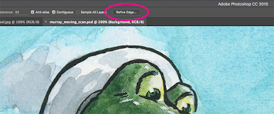
I then adjust the color balance in the image. I usually do this for each major color in the illustration. For example: the green in the gator will be one Adjustment Layer, the green in the background will be another, and the blue in the sky will have its own adjustment. There are several different ways to select the areas: Magic Wand, Quick Selection tool, or Lasso. I usually start with the Wand of Magic (hold down the "Shift" key to add to your selection area). I also like to Feather my selection before I make any changes (make selection, right-click, or Refine Edge, Feather at 5 pixels). See
B below for Refine Edge. Feathering fades the selection area, which will prevent harsh lines along the edge of the selection.
 |
B. With an active selection area and selection tool, Refine Edge is accessible
in the Menu and by right-clicking. |
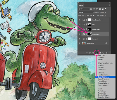
In the example below (see
C), I selected for the green in the gator, Feathered the selection, then activated a Color Balance Adjustment Layer. Notice that the selection is converted into a Layer Mask when I open up a new Adjustment Layer. Then I adjust the sliders to match the original art. I repeat this for each major color in the piece.
 |
C. Select for a color, Feather, add Color Balance Adjustment Layer.
Notice that the selection converts into a Layer Mask. You can modify the
Mask by painting white for areas you want the adjustment to affect or
black to mask the effect. You can even paint gray for more subtle adjustments. |
A quick note about calibrating your monitor: I find it absolutely necessary to use a third-party monitor calibrator. I use the
SpyderPro, which I highly recommend.
Adjustment Layers are considered "non-destructive." You can change the settings of the Adjustment Layer without harming the pixels of the original scan. Double-click on the first icon of the Adjustment Layer to pop-up the Properties Panel and tweak your settings. Please see
D below.
 |
D. Double-click the first icon to open up the
Properties panel so that you can adjust your settings. |
As a final step, I often create a Hue/Saturation Adjustment Layer on the top to see if boosting the overall Saturation helps the image. If so, I'll keep it. If it doesn't make much difference, then I'll just undo it.


