Tuesday, December 9, 2014

Photoshop Brushes - Texture Modes

A Brush from my "Dry Media" Collection that I use a lot is the one I call Chalky Scratchy. It gives an effect like a hard pastel on a textured surface. I achieved this effect by attaching a texture to a Brush and trying different Texture Modes (found on the Brush Panel; please see screen shot A below).

Click here for my post about attaching a texture to a Brush.

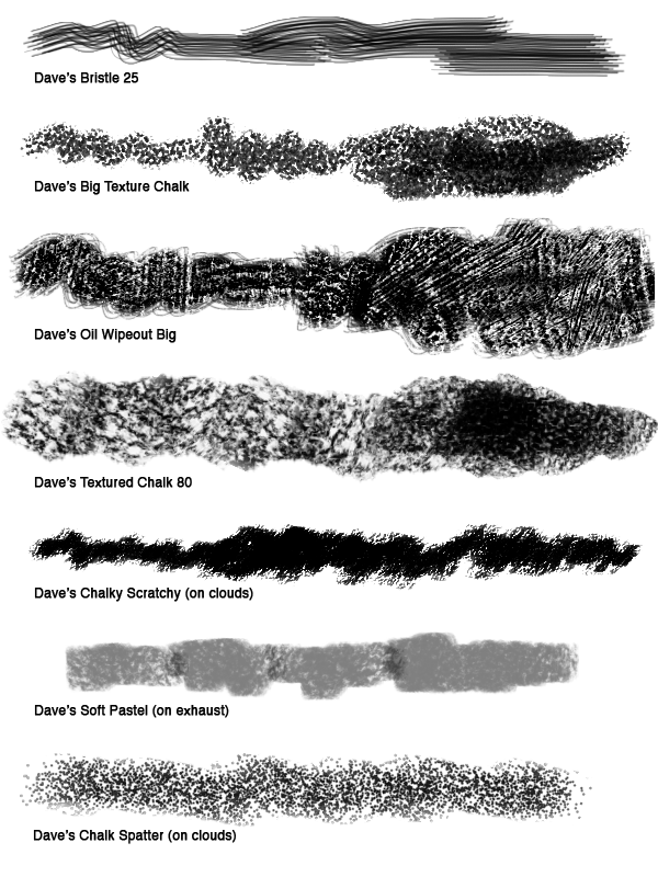
One of the strengths of Photoshop is the ability to attach textures to Brushes, but many times the texture effect seems too soft. Applying different Texture Modes can increase the texture and give you a whole range of effects for you to use in your digital painting.


A. The Brush Panel. Texture Mode is highlighted in
the middle of the Panel. Click to enlarge.


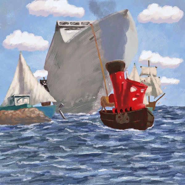
The default setting for my Chalky Scratchy Brush is Color Burn, which can give a contrasty effect. The Multiply mode adds a lot of texture inside the stroke, while Overlay gives a softer effect. Hard Mix is similar to Color Burn but is more solid in the middle of the stroke. Please see the swatches below (screenshot B).

Try playing around with lots of Brushes and textures, because different combinations will give you different--and often, surprising--results. The Preview at the bottom of the Brush Panel will give you a good idea as to what you're going to get. And remember, if you find a new setting that you really like, click the New Brush button on the Brush Panel (bottom righthand corner; it looks like a page with the corner turned up; see screenshot A above) and save your new Brush.

B. Here are some different Texture Modes that gave good results with this Brush.
Click to enlarge.

Click here for more info about my Dry Media Collection.

Click here to buy the Dry Media Collection.

Monday, November 10, 2014

Inktober Mash-Ups

Inktober was a lot of fun! I love the clarity of black line on white paper! Here's a compilation of all my Inktober drawings. You can scroll down through my blog to see bigger versions of the individual drawings.

Click to enlarge, or just scroll down my blog.
Click to enlarge or scroll down my blog.

Friday, October 31, 2014

Thursday, October 30, 2014

Wednesday, October 29, 2014

Tuesday, October 28, 2014

Monday, October 27, 2014

Sunday, October 26, 2014

Inktober: Day 26

Yet another old woman drawing:


Saturday, October 25, 2014

Inktober: Day 25

Another version of the old lady ...


Friday, October 24, 2014

Inktober: Day 24

And this is her cat (see Inktober: Day 23) ...

Brush and ink over blue pencil.

Thursday, October 23, 2014

Inktober: Day 23

I drew the old woman from Hansel and Gretel for Inktober: Day 23

Sable brushes, Higgins Black Magic ink

Wednesday, October 22, 2014

Tuesday, October 21, 2014

Inktober: Day 21

I've been traveling and missed a bunch of Inktober posts--maybe I'll be able to catch up. Here's the ink drawing for day 21:


Wednesday, October 15, 2014

Inktober: Day 15

Halfway through Inktober ...


Tuesday, October 14, 2014

Inktober: Day 14

Here's Murray for Inktober, Day 14:


Monday, October 13, 2014

Sunday, October 12, 2014

Inktober: Make Up for Day 5

I was gone all day for Inktober, Day 5, so here's a make-up ink drawing:


Inktober: Day 12

Old crone's cottage for Inktober:


Saturday, October 11, 2014

Inktober: Day 11

Here's Murray and Dragonfly for Day 11:


Friday, October 10, 2014

Inktober: Day 10

I wanted to practice on an astronaut for Inktober, Day 10.


New York Comic Con

I checked out the New York Comic Con on opening day. It was a little overwhelming. I spent most of the time in Artist Alley. I picked up some great books by Nathan Fox, Sanford Greene, and Ryan Browne. Click on any photo to enlarge.


This is a detail from the photo below.


Yep, there was a lot of cosplay going on.

Star Trek and Star Wars ... together?
Note Azog in the background.

Here's Azog at the Weta booth, looking as lifeless
as he did in the movies.

Artist Alley was more manageable than the main floor, plus,
that's where the artists were!

Thursday, October 9, 2014

Inktober: Day 9

Pentel Pocket Brush

Wednesday, October 8, 2014

Inktober: Day 8

Here's a drawing of Murray for Inktober

Brushes, Higgins Black Magic ink

Tuesday, October 7, 2014

Intober: Day 7

Sable brushes, Higgins Black Magic, Pro White

Monday, October 6, 2014

Inktober: Day 6

Here's today's Inktober post. It's about the time in third grade when I got into trouble for drawing on the back of my test. The blank white page was just begging me to draw a knight battling a monster on it!


Saturday, October 4, 2014

Inktober: Day 4

Pentel Pocket Brush, Kuretake Brush Pen, Pro White

Friday, October 3, 2014

Inktober: Day 3

Robot drawing. There will be more ...

Pentel Pocket Brush, Kuretake Brush Pen, Pro White, over blue pencil drawing.

Thursday, October 2, 2014

Inktober: Day 2

I wanted to practice foliage for today's Inktober drawing.

Pentel Pocket Brush, Kuretake Brush Pen,
blue pencil underdrawing. Click to enlarge.

Wednesday, October 1, 2014

Inktober: Day 1

I plan on participating in Inktober, which is doing one ink drawing a day through October, mainly for practice. Here's the first one. I think the subsequent ones will be less involved ...


Brush, Higgins Black Magic Ink, Pro White, blue pencil underdrawing.
Click to enlarge.

For more info about Inktober, check out Jake Parker's explanation (he's the dude who started it).

Tuesday, September 30, 2014

"Walrus" Process

Earlier this year I illustrated an educational reading book called Where's the Walrus? I did the final drawings in ink on cold press watercolor paper, and then painted them in watercolors. I scanned the painting, adjusted the scan in Photoshop, and digitally added more contrast and detail.

Here's the final image:

This is the final version. You can see that I increased
the contrast and added details (mainly on the walrus).
Click to enlarge.


Here's the painting before most of the digital manipulation:

The scan with some color correction. Click to enlarge.


I like to leave my raw scan on its own Layer and use Adjustment Layers (and Layer Masks to target the changes) to optimize the scan. To increase the shadows, I created a new Layer, set the Blending Mode to Multiply, and painted with a cool gray. I usually use a basic Spatter Brush for shadow areas. To lighten some areas, I painted on a Layer with the Blending Mode set to Lighten. You can also use Screen, if that gives you better results (try both to see). You also may want to lower the Layer Opacity to soften the effect. The final step is painting in highlights on a Normal (opaque) Layer with a textured Brush.

Here's my Layer set-up. I like to leave the scan on its own
Layer and make my adjustments on their own Layers.

Here's a detail. Click to enlarge.

I used to touch up watercolor paintings with Stabilo CarbOthello pastel pencils and Rembrandt soft pastels, and that was the look that I was going for with this project. I did almost all of my digital retouching with just one custom Brush (Dave's Big Texture Chalk). The Brush did a good job of mimicking pastels on textured watercolor paper.

I created the Brush so that the texture gets bigger as
the size of the Brush increases. Please see the right
sidebar for more info on my Brush Collections. 

Tuesday, September 9, 2014

"Tiny Tug" Process

I did this illustration for an educational client earlier this year. There were ten illustrations in all.  

I started with an ink drawing on paper. I scanned in "Black & White" mode to clean it up. Many of the elements were going to be animated, so I couldn't render the reflections in the water.

The ink drawing. Click any illustration to embiggen.

I blocked in the sky on its own Layer. The line work is on a
Layer with the Blending Mode set to Multiply. 

For the water, I painted a big swatch with watercolors, scanned it,
and adjusted it for each of the ten illustrations in this book.
Please see the Layer set-up screen shot at the end of this post.

I added the clouds on their own Layer. I made a looping selection
with the Lasso for the basic shape.

I blocked in the cruise ship on its own Layer. I used a Brush with
bristles to accentuate the contour. Please scroll toward the end
of the post to see which custom Brushes I used.

Here I've painted in the rest of the boats. I block in the shapes at
100% opacity (usually with different browns), then Lock the
Transparent Pixels (see Layer Panel below). After that I render
with custom, textured Brushes.

The exhaust on its own Layer.

Here's the illustration with no line.

The client thought that I needed to pump up the colors, so I went through each Layer and made an adjustment: Image > Adjustment > Hue/Saturation; then increased the Saturation. After that I took my Brush, changed the Mode to Color (see screen shot near the bottom of this post), and painted brighter colors over some of the areas. Painting in Color Mode keeps the existing tonal values but just changes the color. You could also create a Layer, set the Blending Mode to Color, and paint on that. Because the client wanted specific elements grouped by Layer, it was easier to make adjustments to individual Layers.


Here's the final with pumped up color.
                                     
Detail. Click to enlarge.

An animated version.


The Layer Panel. Click to enlarge.

Here's where you change the Mode for the Brush.

These are the main custom Brushes that I used. They are included in the
Wet and Dry Media Brush sets. Please see the sidebar for ordering info.